
#HTE
A Great Example of Better Data Visualization: This Voting Map GIF
Done properly, the art of data visualization can be an incredibly powerful tool for educating people. It allows us to understand things that would otherwise be ungraspable due to their sheer complexity.
Done improperly, data visualization can be incredibly misleading. It’s important that we have talented and hopefully unbiased (I know, what are the odds) designers presenting the information.
As one example of how bad data visualization can mislead, take a look at this map below. What you’re seeing is a map of how each county in the United States voted in the 2016 Presidential election (Red = Republican, Blue = Democrat).
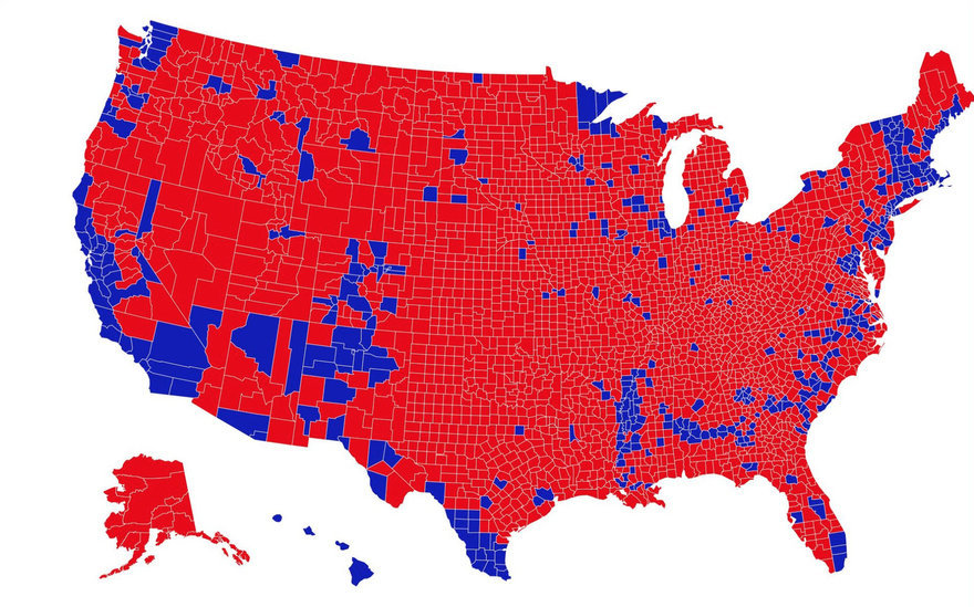
It looks like a landslide–because visually, it is. However, this is a wildly inaccurate representation of proportionality vis-à-vis the population, because all of those little shapes representing counties have vastly different amounts of people living within them. As some might put it, “Land doesn’t vote. People do.”
Data scientist Karim Douïeb figured that a more accurate way to represent how people voted is to use colored dots, varied in size proportionally to the population of each county. He turned the results into this GIF, which provides a clearer picture:

Pretty eye-opening, no? And yet, while this is clearly an improvement over the ham-fisted method of the first map in this entry, even this is not quite accurate. Within each of those large blue dots, you still have plenty of people who voted red, and vice versa. These results only show you which party won the vote in each region.
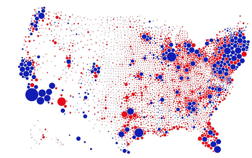
What do you think we’d see, if this data represented actual individual votes and we could zoom in on each one? The country is now more divided than ever, and just about evenly split. So all I’m certain of is that zooming out, we’d see a perfect shade of purple.
(Note: For those of you who’d like to further investigate or verify, Douïeb cites this “How well does population density predict U.S. voting outcomes?” article and analysis as the source of his data.)
https://www.core77.com/posts/90771/A-Great-Example-of-Better-Data-Visualization-This-Voting-Map-GIF