#HTE


Guangzhou-based design studio DOMANI is back on our pages, with yet another killer retail project. This time for a young Chinese fashion brand Urban Revivo, and their flagship on Huashi Plaza, Huaihai Road, Shanghai, China.
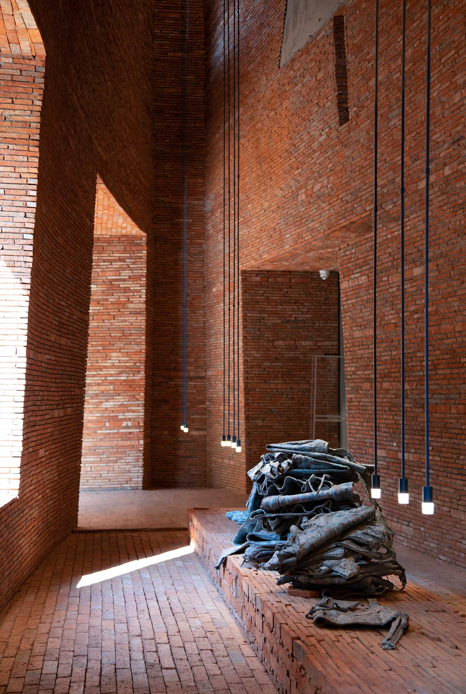
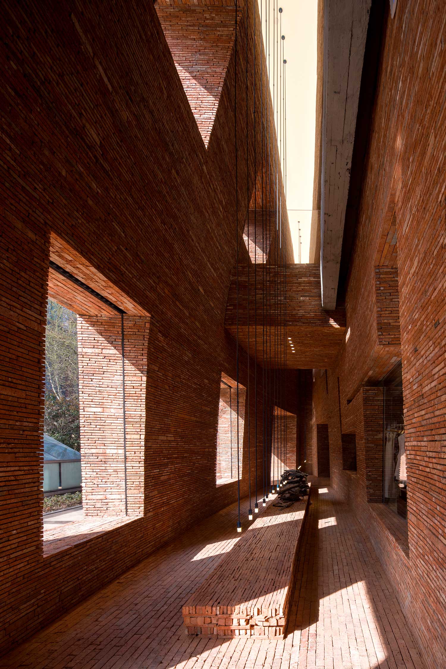
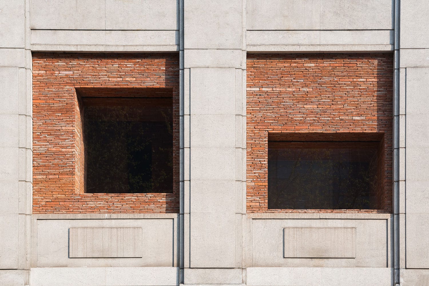
The store is set within an existing 1980s building, which the city didn’t allow having any external modifications to the original fabric. In order to create a commercially successful, captivating retail experience, DOMANI decided to insert a space between the building’s façade and the store’s new entrance. They pushed back the entry point by 3 metres from the original façade, creating a two-storey brick “Canyon”. The canyon creates a new landmark from an ordinary site while making a comment on the possibilities that lie in the refurbishments of previously unremarkable buildings.
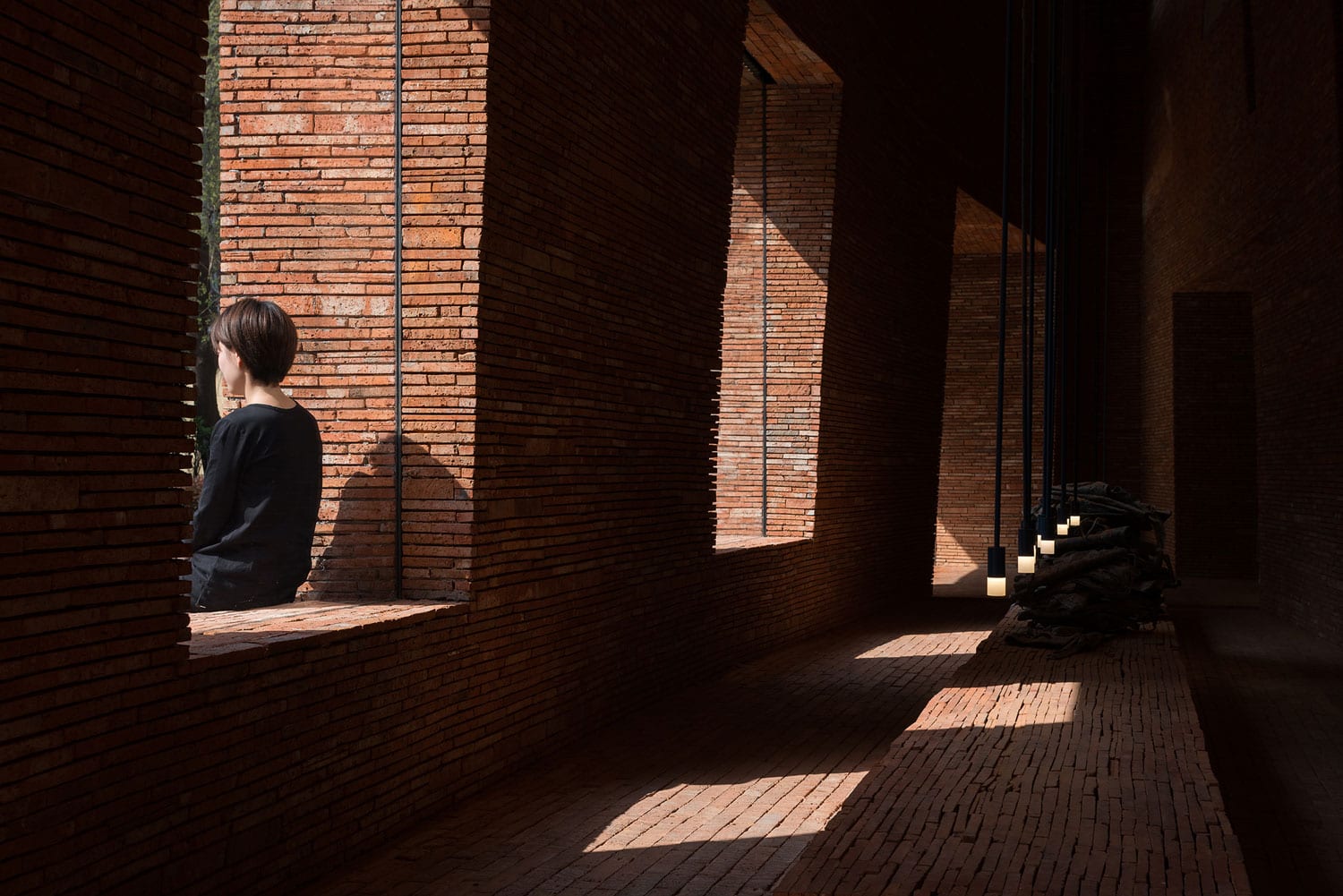
DOMANI searched for discarded material to use within the canyon, settling for a red clay brick that’s between 60-80-years old, and extensively used in Chinese construction. They modernised the material by building a distinctive three-dimensional experience bathed in natural light – from 110:00 am in the morning to 4:00-6:00 pm in the afternoon, the sunlight passes through the space, creating a dynamic experience.
Related: 1WOR Flagship Store In Shenzhen, China By DOMANI.
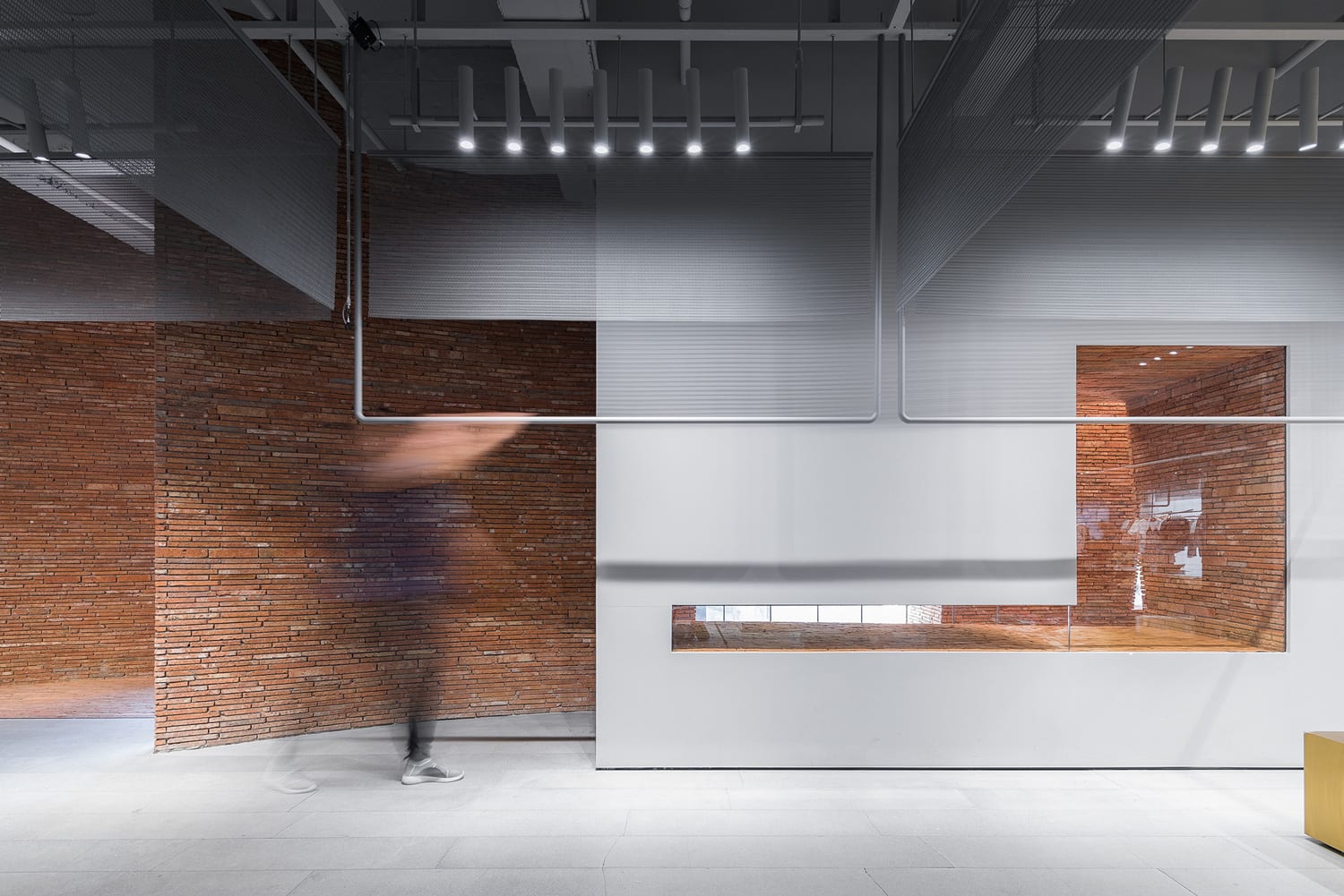
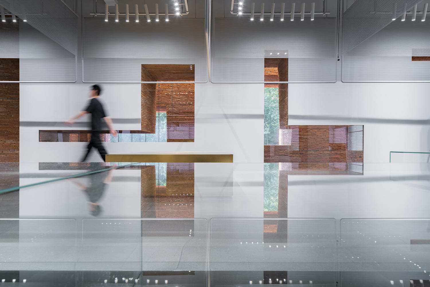

The traditional rectangular windows of the original building are projected into the canyon, while the carved side walls dictate the route of light. The windows of the interior wall are more contemporary in nature, signalling at the contrast that lies inside.
Within the canyon, DOMANI inserted 10-metre-high suspended light fixtures that draw people’s attention to the commercial space on the second floor. The lights illuminate and deliberately emphasise a bespoke installation created for this project that lies underneath them.
“We collected some products from the store and processed them with a mixture of cement and acrylic,” explains the design team, who worked with an art exhibition design brand A&V to create the installation. “Soft, fresh products were covered and hardened, becoming completely different in context. In fact, apart from being seen as ‘abandoned’, they also allude to the concept of ‘ time ‘.”
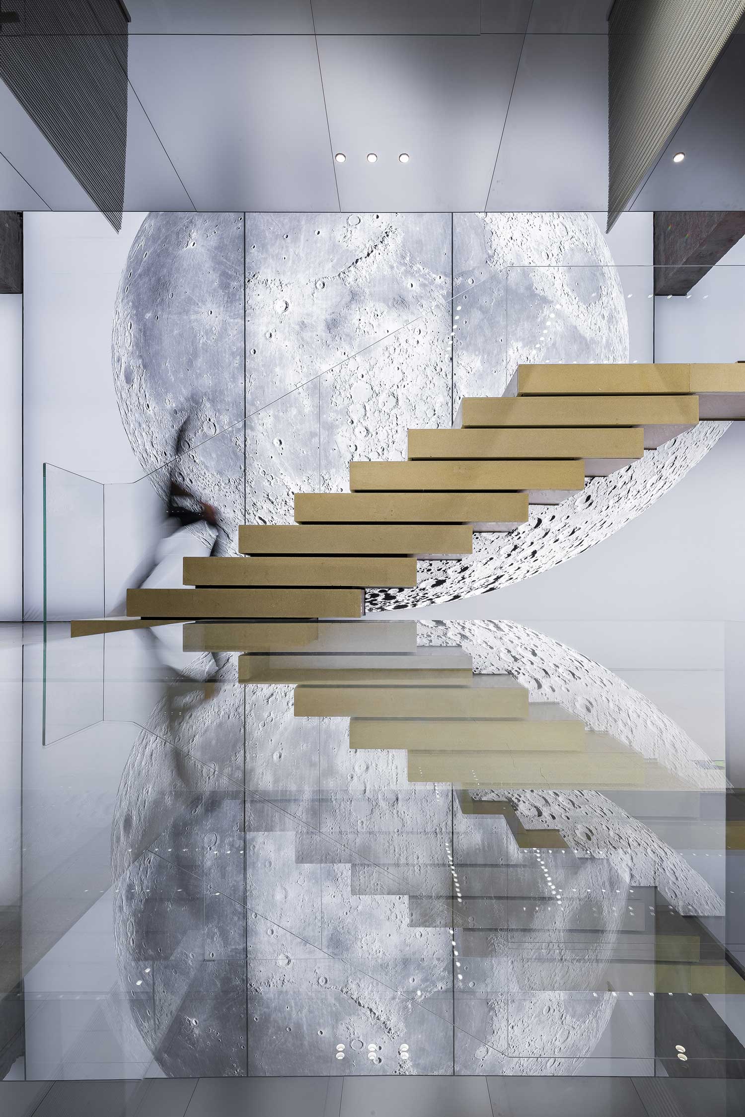


Inside is an entirely different story. The solidity and the texture of bricks are replaced with smooth, slick, reflective and backlit surfaces. Brushed brass display cabinets gleam under spotlights, while mesh curtains and polished clothing racks divide the space.
The arresting seven-meter-diameter image of the Moon is located on the main wall of the store, attracting the eye towards the stair that takes the visitors to the second floor. The dreamy, backlit image adds a surreal and playful element to what’s otherwise a super slick interior. After the “canyon”, the moon graphic is another memorable element that acts as a visual anchor. And as a little bit of Trivia for your Friday, this image is currently the largest printed moon in China. Wowzer.
The post Urban Revivo Flagship Store in Shanghai, China by DOMANI. appeared first on Yellowtrace.
http://www.yellowtrace.com.au/domani-urban-revivo-flagship-store-shanghai/
