#HTE


It’s a hard task to continually keep re-evaluating and re-inventing the humble workspace. First, we made it open plan, tore down walls and put everyone in workstations. Then we designed break-out spaces and lounges and meeting rooms that felt like cafes. We added proper kitchens with long collaborative marble benches so you’d feel like you’d never left the house. And then we add plants. But not the horrid 70’s sort – the integrated plants, cascading down from cable trays suspended over your head. What more was there to explore? Surely there was nothing left to re-invent?
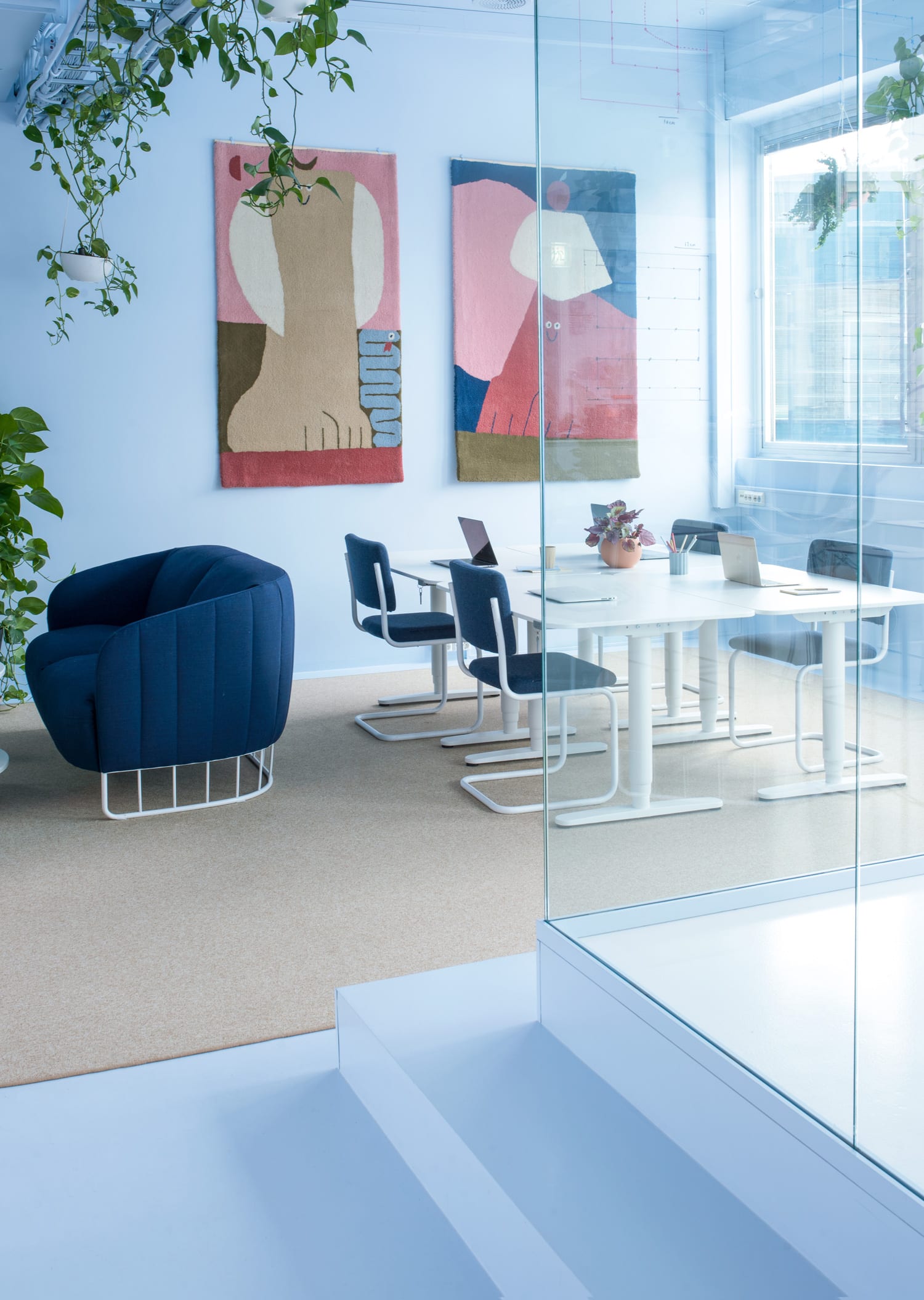
Well, as it transpires, office design had not been explored to the furthest recesses of the universe. Hats off to the Norwegian design studio Kvistad who have recently completed a major upgrade of Bakken & Bæck’s HQ in Oslo. They’ve decided that the new office interior should be modelled on that of a spaceship. And why not. After all, there’s nothing like a little fun and whimsy to make a day at the office pass a bit quicker.
This unconventional office interior has been described by the architects as “s union of spaceage, futurism and friendly Scandinavian forms.” It’s hard to know what that means exactly but it certainly sounds intriguing.


A lot of their ideas have been taken from space-faring vessels. They have painted all the floors, walls and ceiling in the same colour, to give a feeling that everything is moulded from the same material. But they have also extended the principal to other coverings such as the carpet.
“Some rooms have carpets on floors expanding to cover the walls, suitable for a zero-gravity environment. Many of the details are supported by thin lines to resemble weightlessness,” explain the designers.
It is hard to know how much work gets done in a zero-gravity environment and it is equally as difficult to ascertain if this concept of a Scandinavian Spaceship will take off as a global trend in office design. But what can be said of this interior, is that if you put the spaceship element aside, the colourways are incredibly engaging. The pastel blues, the salmon pinks and the vibrant orange make for a colourful palette to work within. Scandinavian design is timeless as we know, so whether the elements such as lighting or joinery have been specifically chosen to mimic that off a spacecraft, the Scandinavian element is certainly strong in the delivery. And really – just because we’re not kids anymore, does it mean we can’t continue to push boundaries, to explore, even if it is to the furthest recesses of the universe?


[Images courtesy of Kvistad. Photography by Lasse Fløde and styled by Tea Wolff.]
The post Bakken & Bæck Office in Oslo, Norway by Kvistad. appeared first on Yellowtrace.
http://www.yellowtrace.com.au/bakken-baeck-office-oslo-norway-kvistad/
