#HTE
A Designer Buying a Car, Part 4: Subaru Forester, Aesthetics and Practical Considerations
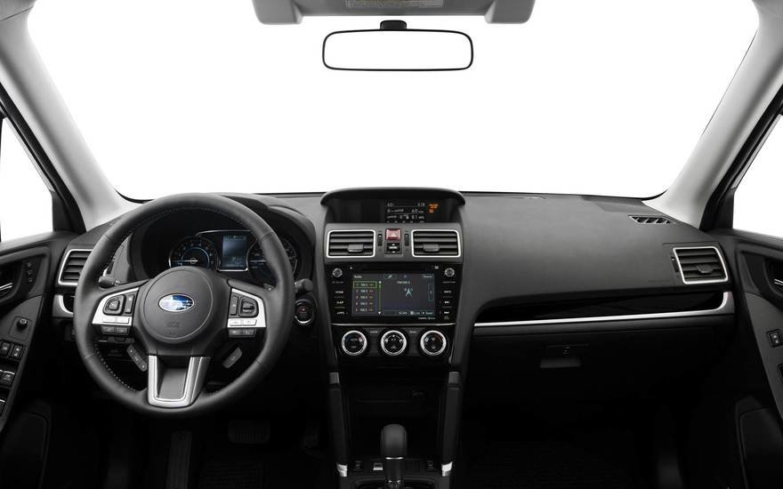
In contrast to the Mini Clubman, the interior of Subaru’s Forester looks sober and utilitarian. Nothing here screams for your attention, which is what I prefer.


However, the exterior loses me right away.

The designers have repeated the sin committed by everyone producing a crossover these days, which is to introduce an arbitrary angle into the rearmost side window to make it “interesting."

In this case it’s a jump ramp at the end of the beltline. This interrupts and ruins what should be the longest and most eye-pleasing line of the car.


The designers’ lack of restraint can also be seen in the headlights, taillights and even rearview mirror. It’s as if nothing is permitted to have a clean, honest shape, but must at all costs be interrupted by random angles, notches and half-hearted curves.


The surface changes across the hood are distressing. It’s as if someone asked "Should the hood be concave or convex?” and the designers screamed “BOTH!”

Here’s a fine example of visual chaos where none of the lines relate to each other.

Let’s extend them and see how they intersect:

It’s busy, random and distracting. The car practically looks like it was designed during a game of “Exquisite Corpse.”
Subaru probably can’t be beat for practicality. The company has a great reputation for reliability and AWD prowess. Two friends of mine are part of Subaru’s cult following and rave about how fantastic the cars are to drive and how hardy they are. But there’s just no way I could own a car that looked like this.
____________
Up Next: The Volkswagen Golf Alltrack
http://www.core77.com/posts/78279/A-Designer-Buying-a-Car-Part-4-Subaru-Forester-Aesthetics-and-Practical-Considerations
