#HTE


Located in Amagansett, NY, one of the small beach towns in the beautiful Hamptons, the architecture of this existing home didn’t instantly draw Jessica Helgerson Interior Design studio in like many of the historic old homes they are accustomed to working on. But the client was delightful and thoughtful, which made them want to take on this renovation project.
“The NYC based clients found us online. When they reached out to us, Jessica and I happened to be in NYC for meetings on another project, so we met up with the owner for coffee and knew right away we wanted to work with her on the project,” explains Chelsie Lee of Jessica Helgerson Interior Design.
After hearing about their client’s aesthetic aspirations, the team felt inspired to pour all of their design energy into radically transforming the house. They partnered with a local architecture firm, TBD Design Studio, and together they explored several different planning options for the home.
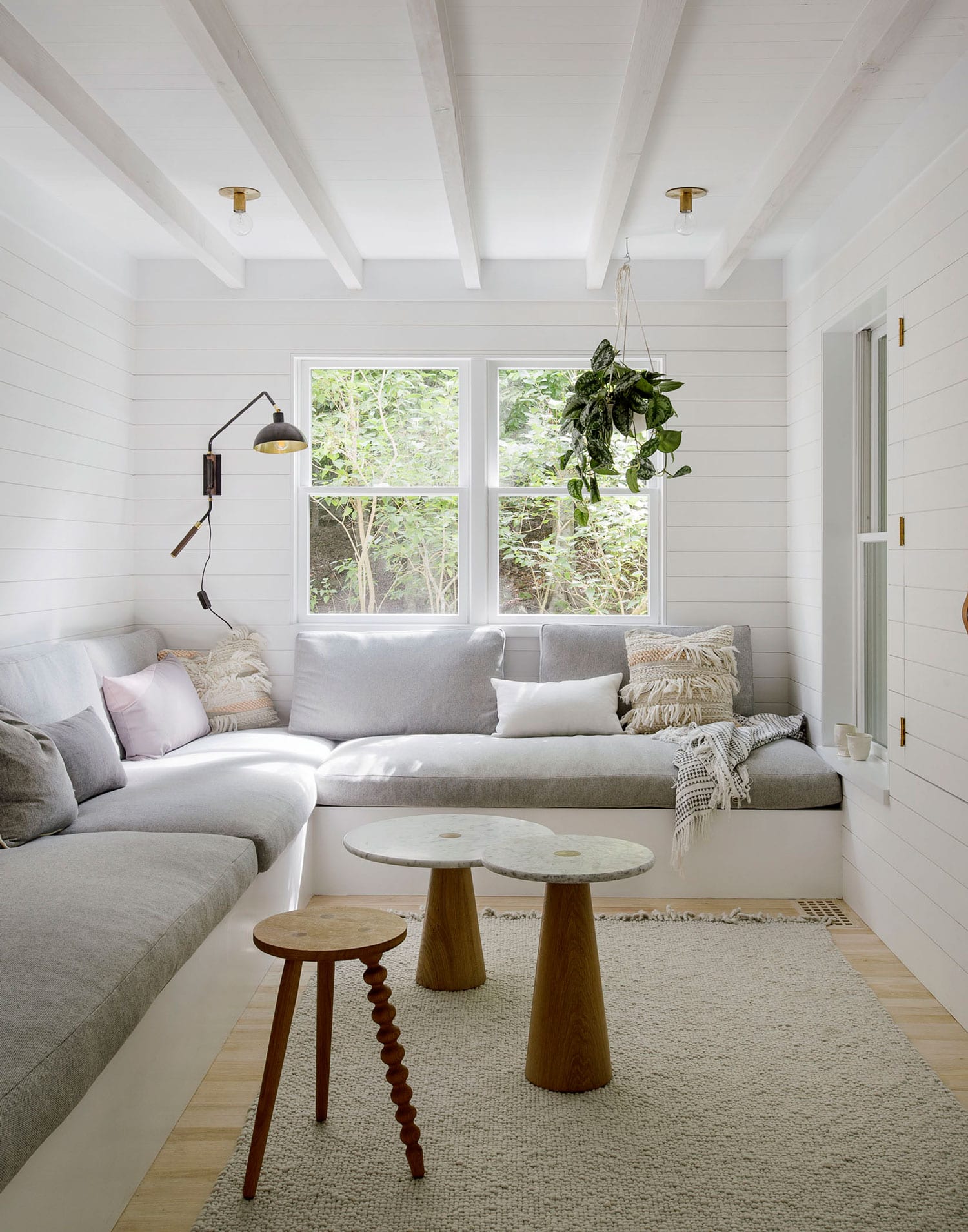
“The plan changes were very significant – nearly every room shifted. We moved the kitchen to the location where there was previously a screened-in porch, adding to the interior footprint a bit. We opened the staircase up completely, added two bedrooms and one more bathroom. We added two cosy rooms with big built in sofas for reading and relaxing,” shares Lee.
The overall palette is restrained, consisting of pale and white-painted timbers, handmade white tiles, marble and brass, while the approach to all new millwork and cabinetry is minimal Scandinavian. “With regard to the decorating, we were inspired by our client’s personal taste when selecting furniture, lighting, and art – a mix of trendier, modern items and timeless pieces.”
The renovation took approximately 9 months, and it was completed in the summer of 2016. Read on for additional insights about this project from the design team below.
See more from Jessica Helgerson Interior Design on Yellowtrace here.


+ Your favourite thing about this project?
My favourite thing about this project is the radical transformation that it saw. It’s the most extreme before and after of my career and that is incredibly rewarding. I also love hearing from the clients how much they love their family time together in the home. They’re so appreciative of the “after” and that feels great.
+ Most challenging aspect?
Probably getting the exterior to be more attractive. To be really frank – this house was not an architectural gem in any way and the exterior elevations were really pretty unattractive. But (and this is in large thanks to TBD Design Studio) by making a few key moves, repainting it all white, adding a front porch, and changing some windows we were able to get them to a much better place and the before and after is almost unrecognisable.


+ What did you learn during the project?
We were nervous about adding wood and beams to the already pretty low ceilings on the first floor, concerned that would make them feel even lower. But, we found that once the ceilings had texture and interest you didn’t mind being so close to them. That was probably the single best move we made in making the house feel warm and full of character – getting rid of expansive sheetrock ceilings.
+ Would you have done anything differently?
I think we feel pretty content with the results of this one – nothing nagging comes to mind. So, I won’t make something up. :)
+ Any other interesting facts you could share with us?
Just that the whole team had so much fun on this project – the delightful clients Andrea and Adam, myself and Jessica, Josh Weisleberg and Selin Semaan from TBD Design Studio, and the contractor Przemek Kenczynski all worked really well together and there was a lot of funny email banter and light heartedness that all stemmed from our clients. They are hilarious and so fun to work with, and their approach to life really trickled into the project. It made the process so much more fun!
See more from Jessica Helgerson Interior Design on Yellowtrace here.


[Images courtesy of Jessica Helgerson Interior Design. Photography by Matthew Williams.]
The post Amagansett House Renovation by Jessica Helgerson Interior Design. appeared first on Yellowtrace.
http://www.yellowtrace.com.au/amagansett-house-jessica-helgerson/
