
#HTE
Today’s Urban Design Observation: Unnecessary Signage
While they clearly did not hire a graphic designer to lay out the type, this sign cost the city money to design, produce, distribute and install.
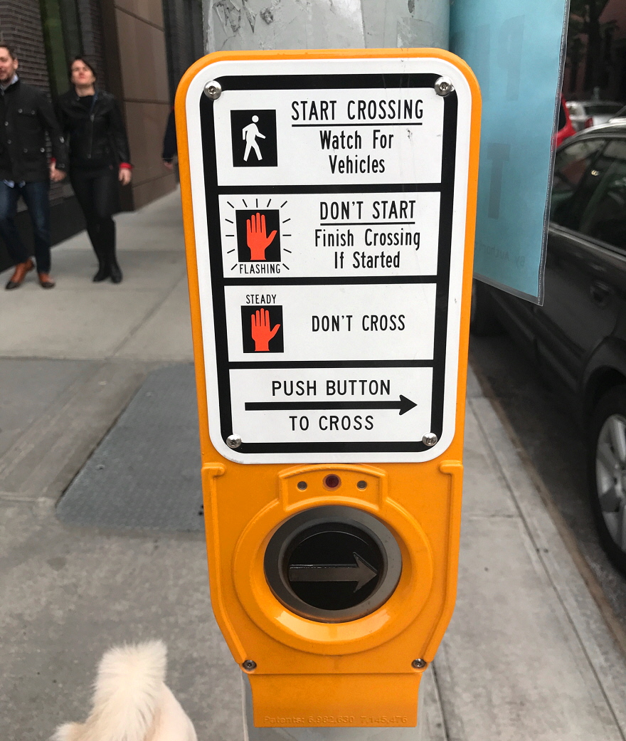
And it’s completely needless. The entire point of these two symbols…

…is that they don’t require an explanation and can be understood by those who cannot read English. Depending on your age you may not remember, but these signs used to look like this…

…and the current design is a clear improvement.
Anyways, so here we have unnecessary signage tackling a problem that was already solved by good design.
http://www.core77.com/posts/70530/Todays-Urban-Design-Observation-Unnecessary-Signage