#HTE


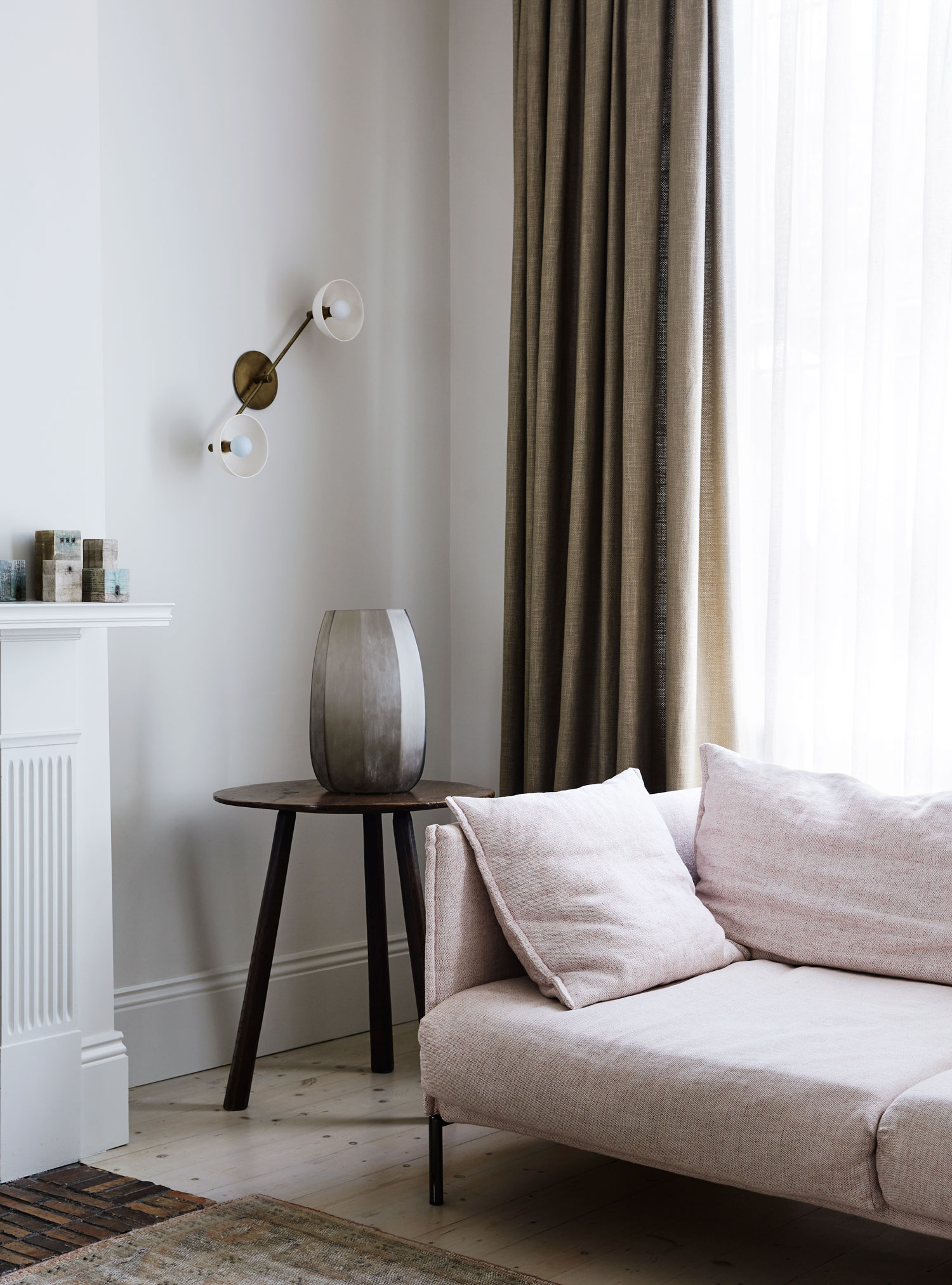
It’s not every day I get to treat you with such a delicious visual feast such as this splendid residential project by Templeton Architecture. There’s more than meets the eye in this incredible East Melbourne residence, that much is for sure, although even just indulging your eye alone (or both of them even!) offers a great deal of satisfaction.
I don’t quite know how to describe what this handsome home made me feel the moment I saw it. An experience of sheer visual ecstasy? For sure. Envy that she isn’t mine? Standard. A sense of allure and a thirst to know more? You betcha. Which brings us here today.
Known as Little Parndon, this significant heritage home was built in 1862 and renovated in 1866 for Eugene von Guerard, one of Australia’s most renowned landscape artists, influential to the romantic landscape painting. The house was then acquired in 1939 for Australia’s 16th Governor General, Lord Casey, and his wife, Lady Casey, the editor and co-writer of Early Melbourne Architecture, which helped Melbourne’s emerging conservation movement. Following its 1950’s renovation, the house remained largely unchanged other than being tarnished by the passage of time, until it was most recently acquired in 2013 by its current owners – architect Emma Templeton and her partner.
The noteworthy reputation of the past owners’ and building’s own historical significance meant that very strict heritage overlays applied to the house, including the unusual protection of the 1950s interior scheme. Yes, multiple peeling wallpaper finishes and all. The design response called for a high level of respect that needed to be paid to the property’s rich history, while intelligently introducing contemporary requirements such as improved circulation, warmth and light.
Led by Emma Templeton, the essence of Templeton Architecture’s work is found in timeless restraint and refinement. Their consideration for the unique qualities of each site, perpetual obsession with proportion, light, colour, surface and junction, combined with a genuine respect for history, create rigorously resolved design outcomes. So it shouldn’t be at all surprising that Little Parndon now has a renewed elegance, underlined by the home’s charming but fading heart, sustaining the sense of enormously rich creativity that once existed within these walls.


We had a chat to Emma Templeton about this remarkable project, who shares with us from a very personal perspective the experience of transforming Little Parndon into a family home for herself, her partner and their two young children. Perhaps the fact this is a home of an architect explains why this project feels extra special. The client was clearly someone who ‘gets it’.
+ What’s your favourite thing about this project?
The kitchen chimney-window. It housed a (still functional) 1930’s gas stove, which clearly had to go! We originally designed a beautiful glasses cabinet for this location but changed our mind at the last minute, instead creating an opening onto the garden. It is perfect – now the view from the front door looks down the corridor, through the kitchen and straight into the garden. Plus, the bench under the window doubles as a casual seat for a glass of wine and a kitchen conversation or as a dining spot for juniors.
+ Most challenging aspect?
Without a doubt the heritage overlay. The history of the building was a huge part of the projects allure, but it also created some significant issues. Heritage was very understanding with respect to our design, but we struggled with their desire for us to retaining the original wallpaper. We settled on keeping one wall of each wallpaper. It was tough to accept given the dilapidated condition of the paper. We worked with a restorer to touch up the chosen walls. Fortunately, the selected finishes complemented the wallpaper and the outcome is far better than originally feared.
+ What did you learn during the project?
The orientation of the house forced us to embrace the south light. We have learned to appreciate its delicate, soft filter and design spaces to enhance these qualities.
In small volumes, every centimetre counts. Before, the courtyard space was virtually unusable –filled with heating boilers, an oversized external stairway and an ugly garden shed. Plumbing pipes and other infrastructure littered the rear exterior walls. Approaching this space in the same way we would an interior, we stripped the space back to its essence and, with the assistance of our landscape architects (Grounded Gardens), we created a new exterior room that greatly improves the livability of the dwelling.
Also, we learned a bit about the implications of using American lighting – but that’s a longer story.


+ Would you have done anything differently?
The stonemason and blacksmith both did amazing work with the wrought iron fence, however, as they are “the guys” in very niche areas, it was a long, long wait. Perhaps we could have confirmed this element earlier in the construction program.
We also would have tried to get a smaller gas meter. Somehow, we ended up with an industrial sized unit that requires specific landscaping to conceal – you would think that we have installed a Jacuzzi on the roof.
+ Any other interesting or quirky facts you could share with us about this project?
During demolition we became lost reading old newspaper clippings used to line the original walls. One story, from the 1860’s, reported bunyip sightings near Geelong. We also uncovered a mysterious wall safe behind the original robes. Sadly it only housed costume jewellery and no Eugene von Guerard originals.


[Images courtesy of Templeton Architecture. Photography by Sharyn Cairns.]
The post Little Parndon in East Melbourne Transformed by Templeton Architecture. appeared first on Yellowtrace.
http://www.yellowtrace.com.au/templeton-architecture-little-parndon-east-melbourne/
