#HTE
We are extremely lucky to have a world filled with creative geniuses that appropriate spaces which are built in one era and transform them into a space that harmoniously incorporate a contemporary one. Be that by planning, use of material or a finely honed sense of detail, the following architectural and interior projects exemplify old architecture meeting new.
It takes significant skill to start a project from scratch, but to take the bones of an existing building and breathe new life into them requires more than just skill. It requires a capacity to understand the many different languages of design. It takes not merely a vision but an appreciation of what has value from the original structure, and then delivering with confidence a reinvention, a new incarnation, a rebirth.
Today we survey 37 (yes, thirty seven!) projects from around the world across single & multi residential, commercial, retail, hospitality and cultural categories, varying in significant and scale. So many amazing examples that carefully and intelligently weave the old with the new, it’s impossible to pick a favourite, even if we do say so ourselves.
See More ‘Stories on Design’ Curated by Yellowtrace.


Photography by Luis Prieto. Images courtesy of Tabuenca & Leache Arquitectos.
The Condestable’s House in Pamplona, Spain by Tabuenca & Leache Arquitectos // This project restores an old sixteenth-century palatial mansion. Through an extensive cleaning and restoration process, the building’s original appearance and size resurfaced, exposing the old wood-panelled ceilings. Without yielding to a contemporary aesthetic, the restoration sustains the natural continuity between the old and the new, which is established through the materials that have been used: wood, terracotta, lime mortars and plaster.
Read the full article about this project & see more images here.


Photography by Pedro Pegenaute.
Design Republic Commune by Neri+Hu in Shanghai // Located in the centre of Shanghai within the historic relic of the Police Headquarters, Neri&Hu replaced the rather dilapidated row-shops on the street front and introduced a modern glassy insertion onto the brick façade. To accentuate the historic nature of the main building, the street level periphery is enveloped by transparent glazing to reveal the carefully restored red brickwork and rough concrete structures. They removed certain floor plates, walls, as well as ceiling panels. Various small and precise incisions have been made in the interior architecture to reveal the building’s history and integrity. Contrasting with the exterior, the starkly white, modern interior is juxtaposed with untouched remnants of brick walls and exposed wood laths underneath crumbling plaster walls.


Photogoraphy © Nicolas Mathéus.
Abbaye de Fontevraud by Jouin Manku in Anjou, France // Fontevraud Abbey and the four surrounding priories that make up a monastery complex dating from the Middle Ages got a complete makeover. The interior of the Saint-Lazare priory was part of this redevelopment. The challenge? Upgrading the structure to integrate a contemporary aesthetic, make it technologically on point and… here’s the kicker, don’t touch or alter the original structure. What do we totally love about this? The public hotel bar, an ‘altar like’ structure beneath those magnificent gothic arches. Pour the martini. We’re never leaving.
Read the full article about this project & see more images here.


Images courtesy of Francesc Rifé Studio.
Caro Hotel in Valencia, Spain by Francesc Rifé Studio // Situated in a building declared Heritage of Cultural Interest (BIC), the Caro Hotel is the first historical monument-hotel in Valencia. A space in which a historical legacy present in its own right, and yet destined exclusively for modern-day hotel use. Rooms are defined by their contemporary, geometric, minimalist interior design based on spatial order and continuity of materials. They are light, quiet and located with views over the private palace patio or the glass roof feature which covers the restaurant.

Photography by Fernando Guerra, FG + SG | Architectural Photography.
House on Bassett Road by Paul + O-Architects // Take four flats and covert it back into a single residence. Use lots of glass. Lots of double height glass… Add a large motorised sash window at the rear of the home that opens onto the garden and you have a stunning design created with a minimalist edge and simple materials. The choice of merely using glass and cement clearly delineates it from the original building, the traditional Victorian façade at the front of the house. It’s a practice that’s widely encouraged by English heritage to show the distinct difference between old and new.


Photography by Toby Scott.

Photography by Alicia Taylor.
The Survey Co Restaurant in Brisbane by Richards & Spence // Take one old laneway in Brisbane, add a sexy fit out of dark timber, brass railings and elegant cylindrical brass lamps, throw some cork on the floor and leave the original brickwork whitewashed and you’ve got a laneway worthy of a Melbourne, cool crowd. New red brick meets the original external plaster walls and delicate brick archways lend a Roman feel to the space. It’s Brisbane architecture at it’s best.
Related post: Interview: Brisbane-Based Architectural Studio Richards & Spence.


Photography by Peter Bennetts.
Collingwood Shop transformed by FOLK Architects // A shop in Collingwood also doubles as an installation by Folk Architects called Watchmaker, which transforms the interior with mirrored panelling. Mirrors are a clever little trick architects use to dissolve the physical boundaries of a space, reflecting as it does the area around it, making the building a chameleon, a product of the buildings that it reflects. The original building is a raw site, made somehow glamorous or special by the addition of mirrored surfaces and display boxes. An important aspect of the building is the glass and mirrored vestibule that marks the entrance from Smith Street. This passage has a transformative effect exaggerating the contrast between Smith Street and the stillness of the site beyond.
Read the full article about this project & see more images here.


Photography © Delfino Sisto Legnani + Marco Cappelletti.
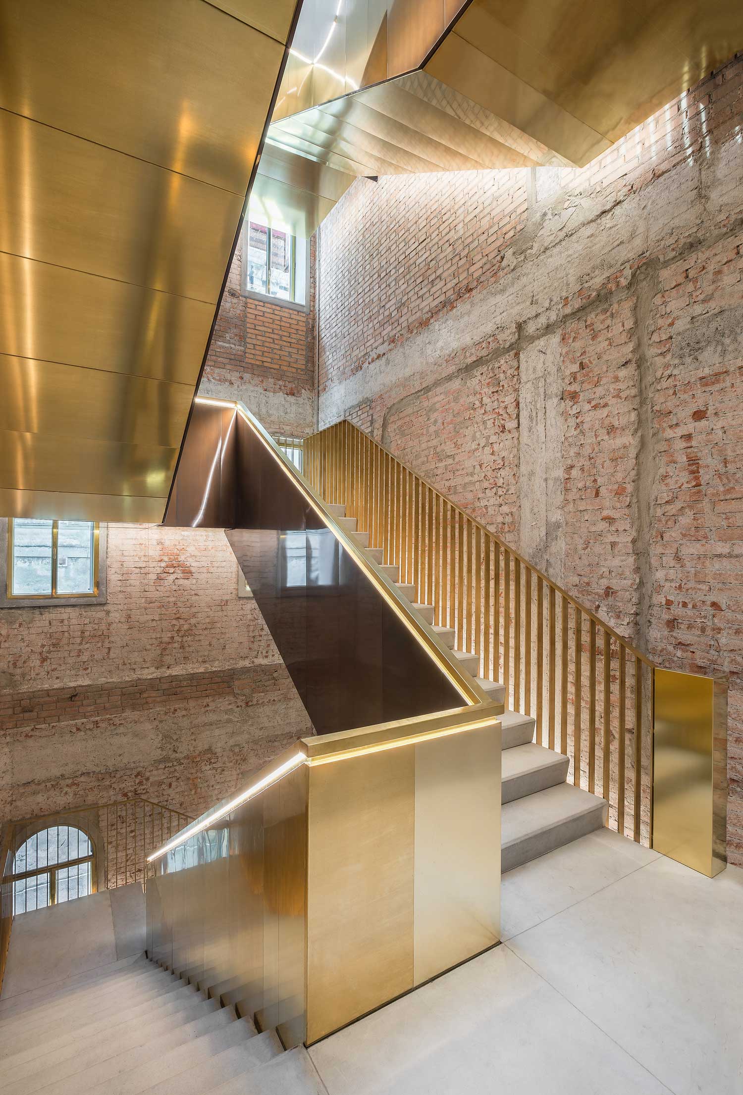
OMA’s Restoration of Fondaco dei Tedeschi, Landmark Building in Venice // First constructed in 1228, and located at the foot of the Rialto Bridge, the Fondaco dei Tedeschi is one of Venice’s largest and most recognisable buildings. It has very recently been transformed into a department store, with original plans presented at the Venice Biennale in 2011. Bright red escalators and shiny brass stairwells sit proudly against the classical heritage features of columns and stone archways. Removing two sides of the existing roof, leaving the building’s profile intact, has created a terrace with rare views of the Grand Canal. New entrances have been added but the 19th century pavilions and courtyards have remained. Areas of the building once lost have been resurrected. Frescos have been reinstated but in a contemporary form.
Read the full article about this project & see more images here.


Images courtesy of Project Orange.
192 Shoreham Street in Shoreham, England by Project Orange // Once a redundant building in an industrial area has been made into a double height restaurant and bar, capitalising on the original shell. The new extension is an abstract expression of the industrial roofscapes that used to dominate this part of the city. It is parasitical in nature, engaging with the host structure in a couple of locations, where windows bite into the existing building. The new roof profile creates dramatic sweeping ceiling profiles bold in its dark grey cuboid form set heavily against the finer brick façade below.

Photography by Fernando Alda.
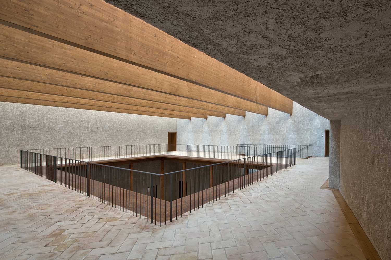
Renovation of the Oscense Theatre by Julia González Pérez-Blanco + Miguel Bretones del Pozo in Huéscar, Granada // The challenge of the project was to restore a church and chapel, recovering them for a different use, without necessarily failing to appreciate and to value the original artistic and architectural elements of the building, or having the new use of these building be unduly affected. The restoration of the Church of Santo Domingo and the Chapel of Nuestra Señora del Rosario was done with traditional techniques and found materials. The architects repaired and maintained many of the decorative elements from the different styles and eras of the buildings. The new construction responded to a more contemporary style with contemporary materials, always cognisant that the design and construction be in harmony with the historic buildings.


Photography by Iñaki Bergera.
Refurbishment of the West Tower in Huesca City Hall by ACXT // Due to its position and volume, the buildings that make up the Huesca City Hall gave the impression of being unfinished. The west wall was a mud wall with rows of solid brick, with irregular openings, some of which were bricked up. The east wall was blind except for an opening on the attic floor. The architects treated the side closings, east and west, turning them into façades, so that the unfinished piece turned into a tower with presence of its own. The new façades are of folded copper, a fine material with a good relationship with the existing materials – stone, bricks and timber. The new façade establishes a heavy-light dialogue with the original volume and has a small projection as is usual with this type of constructions.


Images courtesy of Abalo Alonso Arquitectos.
Fundacion Rubido Romero by Abalo Alonso Arquitectos // The reconstruction of a rural building in A Coruña, Spain was for the headquarters of the Rubido Romero Foundation. It was completed by using traditional methods by discreetly consolidating the existing walls, repairing the tiled roof and adding a bathroom. They painted the interior a crisp white and reused the original timber girders that in turn support the new contemporary lighting. The stunning contrast of the dark timber beams against the white is simply beautiful. The new pale granite flooring sympathetically sits alongside the whitewashed bricks and the crisp new white timber panelled doors. Black varnished steel framing lends a sophisticated and contemporary material to the backdrop of the old farmhouse.


Photography by Amit Kedem.
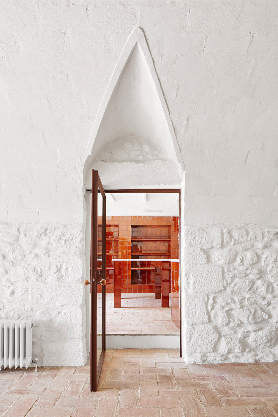
Jaffa House in Israel by Pitsou Kedem Architects // This 100 year old building is located in Old Jaffa, Tel Aviv and is set above the harbour facing the Mediterranean Sea. The architects restored the structure’s original characteristics, the stone walls, the segmented ceilings and the arches, including the exposure of the original materials (a combination of pottery and beach sand). The modern addition is seen by opening up the internal space and using contemporary materials such as stainless steel and iron work. Steel framed doors pivot in openings acting as partitions and openings. The project succeeds in both honouring and preserving the historical and almost romantic values of the structure whilst creating a contemporary project both modern and yet respectful of the building’s history.


Photography by David Grandorge.
Lant Street by Dow Jones Architects in London, UK // A factory conversion, the project involved a transformation of the top two floors of a Victorian former clog-making factory into a home for a filmmaker. The existing roof structure was removed and replaced with two steel and timber box girders, which span the brick walls to create a new horizon at roof level. The space formed inside one girder is a rooftop ʻthinking roomʼ, with views across the terrace and the city beyond. The other girder is glazed to create a room-like window bringing light and volume down to the floor below. Different terraces occupy the spaces between these two enclosures.


Images courtesy of Jonathan Tuckey.
Collage House in North London by Jonathan Tuckey // This family home was the grand transformation of a 19th century steel fabricators workshop in North London. From the street a protruding box entrance gives no clue as to what lies beyond. The house is arranged around a courtyard garden, created by demolishing one of the original buildings on the site. Simple and everyday materials were employed to construct the build, delicately balancing what was required to ground a new home into the pre-existing structure of a former industrial building.
Read the full article about this project & see more images here.


Photography by José Hevia.
Casa C by Camponovo Baumgartner Architekten // The 100-year-old barn is located in the centre of Reckingen, Switzerland. The barn consists of two areas, the lower floor, formerly used to house animals and an upper floor, formerly used as a hay loft. The task was to convert the barn without destroying its outer facade. The main house is downstairs and the new weekend house is upstairs inside the hay lofts. The inner façade is detached from the barn’s original outer wall, generously glazed to visually enlarge the living room and to create a connection between the old and the new elements. The construction consists entirely of wood. The floor is made of native larch, the walls and ceilings are made of a high quality birch inlay, which contrasts the dark old wood of the original barn structure. The roof is newly covered with larch shingles. All the surfaces are untreated and exposed to natural deterioration.
Read the full article about this project & see more images here.


Photography by Davide Galli Atelier.
Casa RJ in Mantua, Italy by Archiplan Studio // The project involved the re-development of a multi-storey building in Manuta, in which this apartment is housed within. The original character of the house was maintained, keeping such elements as the decorative, timber ceiling in order to add layering to the space. The architects kept the original layout of the interior whilst the subdivision of the interior spaces occurs via the introduction of elements of furniture.
Read the full article about this project & see more images here.


Photography by Adrià Goula.
Sala Beckett in Barcelona Refurbished by Flores & Prats // The original theatre, only two storeys high, has seen a dramatic change to its exterior with the addition of a third level. Its once previously grim, concrete façade, almost two dimensional with its shuttered down windows and cold concrete frontage, has been transformed. The contemporary and stunning rooftop addition with its geometric shape boldly rising above the surrounding rooftops is a sight to behold. The new building maintains the spatial characteristics of the original building and appears to grow on top of it. There is a distinctly unfinished character to this building juxtaposed against contemporary finishes.
Read the full article about this project & see more images here.


Photography by Filip Dujardin.
Famous Agency in Ghent by Architecten De Vylder Vinck Taillieu // Architects De Vylder Vinck Taillieu have managed to successfully balance the heritage character of the building, bringing in new elements that create a completely unique aesthetic. Designed for Famous Agency in Ghent, Belgium, the space is an eclectic mish mash of contemporary materials, unique design ideas and heritage features. Fine steel framed glazing are the fronts of meeting rooms and offices overlooking long corridors decked in harlequin patterned black and white tiles. Old timber door frames sans doors read like post modern paintings, pastel hues on steel girders, oak floors, unfinished walls and ceilings, random fireplace surrounds with no fireplace within all echo the feeling of randomness.
Read the full article about this project & see more images here.


Old Manor Park Library by Emil Charlaff // The Old Manor Park Library in the London Borough of Newham is a new public space for artists, makers and people living in Manor Park. The internal partitions, looking much like the boning from the corsets of the 16th century, divide the interior. The boning which consisted of the rigid parts of a corset supported the desired shape of the woman and in much the same way in this space is supported and shaped by the partitions to create a desired end result. The beautifully crafted timber framed glazing panels allow a transparency and a clever way to artistically shape the space. Original ceilings have been restored to life and the nature of the transparent partitions enables the user of the communal art space to see and appreciate the original architecture, the windows, the columns and the intricate ceilings within the interior.


Photography by José Hevia.
House Renovation in Girona, Spain by Arquitectura-G // The large three-storey family home is nestled in the Empordà landscape amongst the rolling fields and fruit trees of Catalonia, Spain. The historic stone walls of the exterior give way to a bright interior that is sculptural, and textural. As with any historical renovation there is always an important relationship between old and new. Arquitectura-G have struck a balance with the combination of existing elements and new interventions. Previous stone archways are complimented by spherical fireplaces, curved tiled platforms, rounded windows and doors and an elegant spiral staircase. These exist in union with rectilinear forms such as beams, columns and metal screens. The material palette of exposed stone, glazed brown tiles, terracotta, painted steel and white paint appear consistently throughout the home.
Read the full article about this project & see more images here.


Photography by Koen Van Damme.
Historical Residence in Gent by Hans Verstuyft Architecten // This ‘Maison de Maître’ in Ghent, Belgium dates from the end of 19th century. The house, crumbling and deteriorated to the point of unusability was completely gutted. The architects reused materials wherever possible. Old paint layers were polished and maintained. The former coach house became a kitchen and the entry to the coach house acts as a large hallway, daringly announcing itself with the inclusion of double height black steel framing deliberately declaring itself not of the previous era. Two steel glazed cuboid extensions were added. The black steel framing of the boxes stark against the white of the original architecture. Like two sun-traps they act as contemporary conservatories.
Read the full article about this project & see more images here.


Photography by Derek Swalwell.
Fitzroy Loft by Architects EAT // This project involved a conversion of a gritty 250m2 brick warehouse in the old industrial area of Fitzroy into a family home. The former industrial building is a mixture of intimately scaled family spaces and vast entertaining voids. Two full height voids act as the lungs of the design, bringing both light and sky views deep into the internal space. The private areas such as the study and bedroom are accommodated on the first floor by volumes of a more intimate scale.
Read the full article about this project & see more images here.


Photography by Sergio Grazia.
Heritage Apartment Renovation in Chiavari, Italy by Nicola Spinetto // Two apartments were made into one in this heritage conversion in Italy. The architects started by keeping all of the elements that are reminiscent of old Italy – the exquisite painted ceilings, tiled flooring and the pale green walls. They added contemporary elements to bring light into the space by the inclusion of Moroccan inspired ceiling grids. Timber ceilings laser cut into patterns allow the light to penetrate the interior. The corridor walls, staircase and floor are all lined in a matching oak timber.
Read the full article about this project & see more images here.


Photography © Do Mal o Menos.
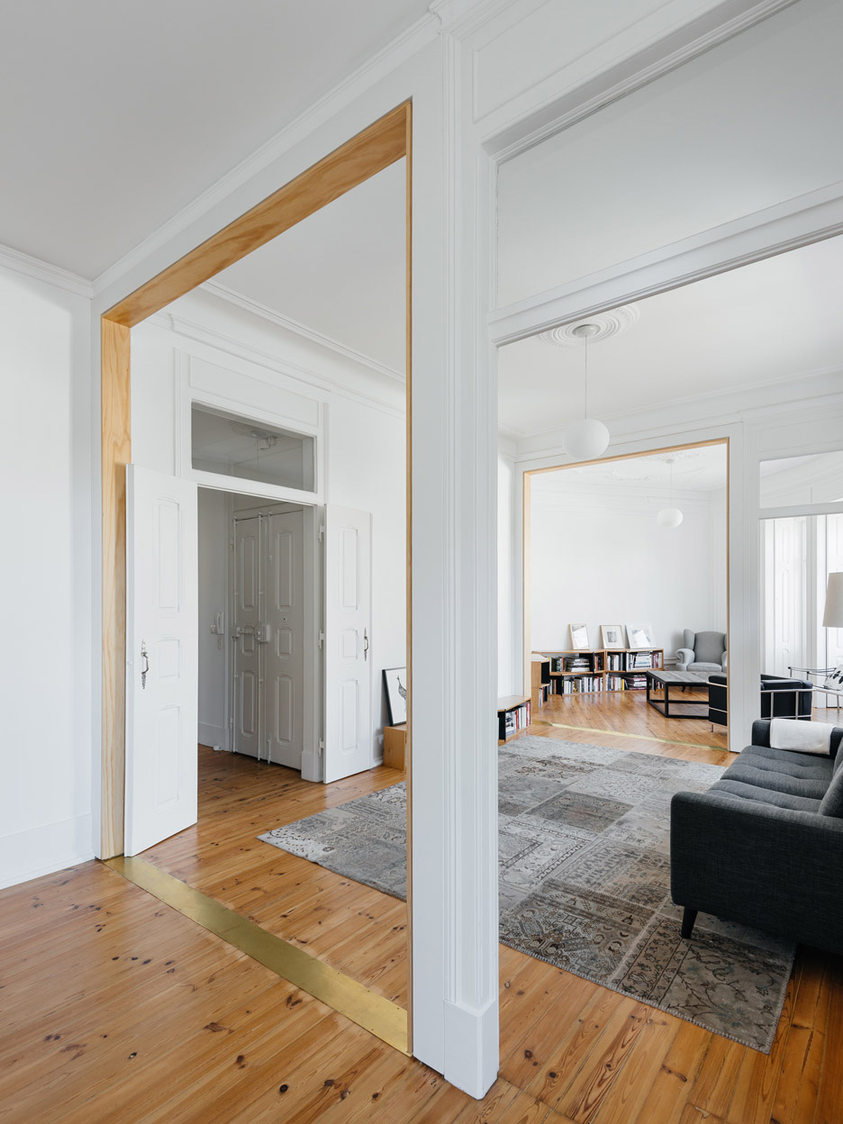
Contemporary Heritage: Lisbon Apartment Renovation by Aurora Arquitectos // Aurora Arquitectos removed walls to open up this apartment in Lisbon to create a larger living space. Most noticeably is the contemporary use of the wooden frames dividing up the living space with their matching slim brass flooring plates. It’s a quirky way to boldly state an opening. Clever details abound like the curved corners to the bedroom walls allowing the original cornice work to transect the space without causing damage to them. It’s a thoughtfully articulated example of how to manage two worlds colliding, the old original architecture and the contemporary, but just as elegant, additions.
Read the full article about this project & see more images here.
The post Stories On Design // Old Meets New: Architecture of Renewal. appeared first on Yellowtrace.
http://www.yellowtrace.com.au/old-meets-new-architecture-of-renewal/
