#HTE
Unusual Furniture Designs: This Haberdashery Cabinet is What Clothing Storage Should Look Like
It’s crazy that you’re reading this on something that has more technology than the Apollo 11 mission computers, yet you store your clothes in an object whose form factor was designed several centuries ago. The chest of drawers is a completely outdated piece of furniture, yet it is something nearly all of us own, and among the first things people buy when setting up their first apartment.
First off, think of how poor the functionality of your standard dresser is:
Items are stacked and viewed from the top.
You take your freshly-laundered clothes, fold them, and place them in stacks within the drawers. This is the dumbest way to store a collection of items you may want to browse through. There’s a reason that file cabinets are designed to store documents vertically; imagine digging through a horizontal stack of paper to find the one you want.
Retrieving an item disturbs the stack.
You go to your dresser to retrieve a particular item of clothing. Unless the target item is right on top, you must root through your stack of clothing. Do you take the time to neaten up the stack each time you retrieve something from the bottom?
No visual signifiers of what’s inside.
I’m guessing most of us follow the established order of:
Top Drawers - Underwear & Socks
Middle Drawers - Tops
Bottom Drawers - Pants & Bottoms
Even still, it would be more convenient to see precisely what’s within each drawer.
A Better Design: The Haberdashery Cabinet
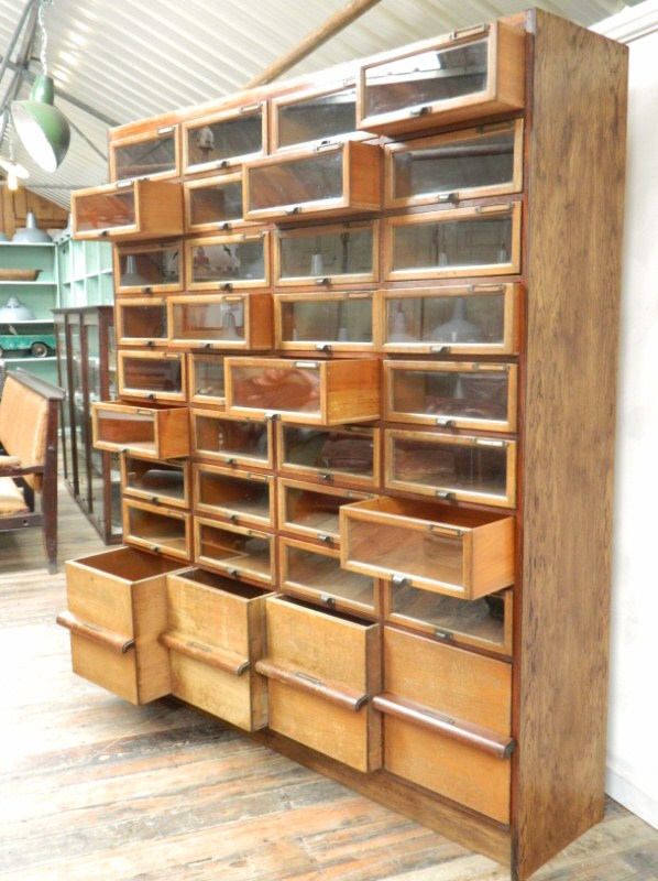
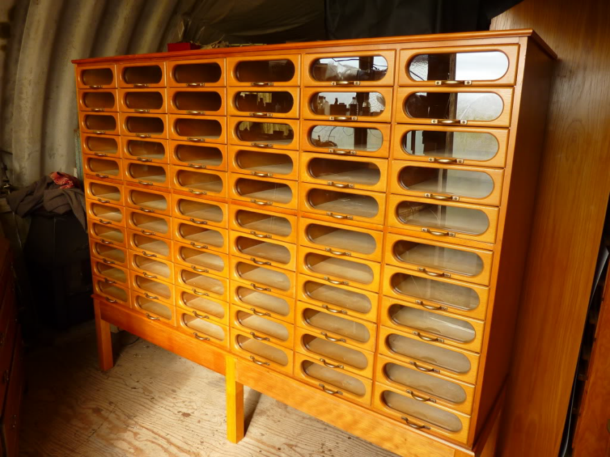
I’ve seen a number of these over the years, but this is the handsomest I’ve come across.
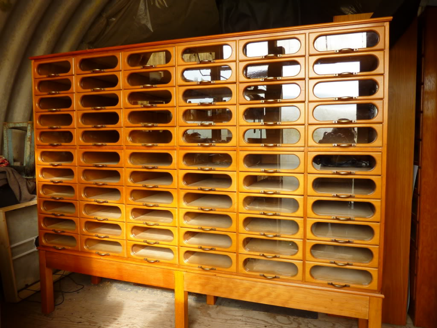
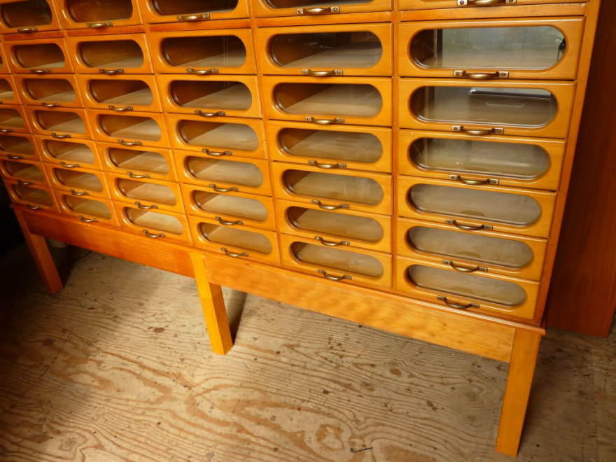
Being designed for a retail environment, efficiency is key, and thus it features the window-fronted drawers that all haberdashery cabinets have.
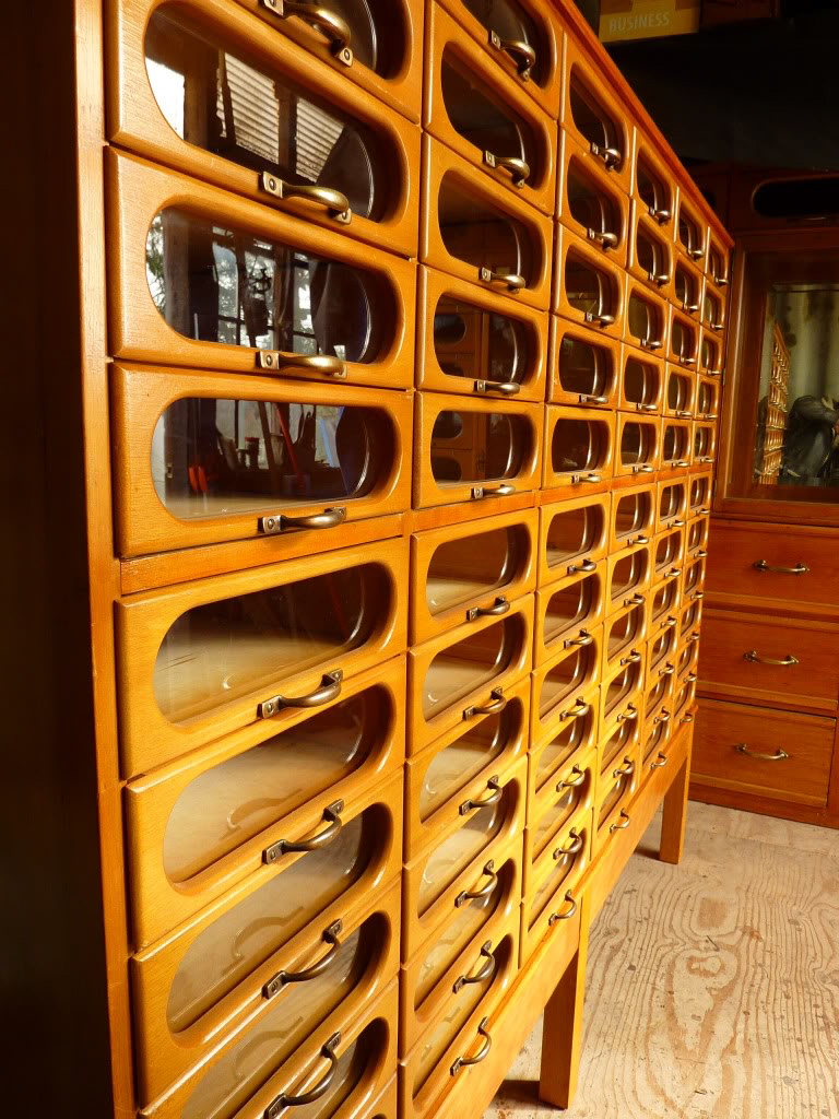
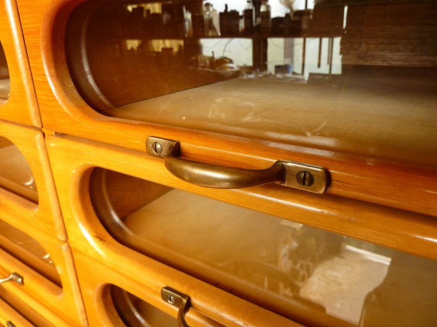
This one, however, is a midcentury piece, and the windows have been framed within a racetrack-shaped aperture in the drawer face.
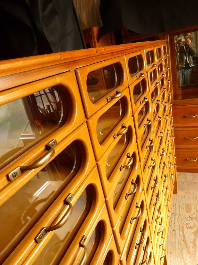
It’s a damn sight better looking than the rail-and-stile construction of the average glass-fronted haberdashery cabinet drawer face.
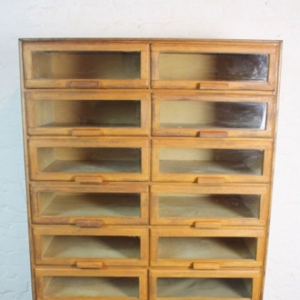
It is also, of course, more wasteful. Consider that the rail-and-stile economically uses thin strips of wood, which could conceivably even be offcuts.
Meanwhile the one pictured here has a singular piece of wood with the racetrack cut out of it. I reckon 75% or more of each drawer face ends up in the burn pile.
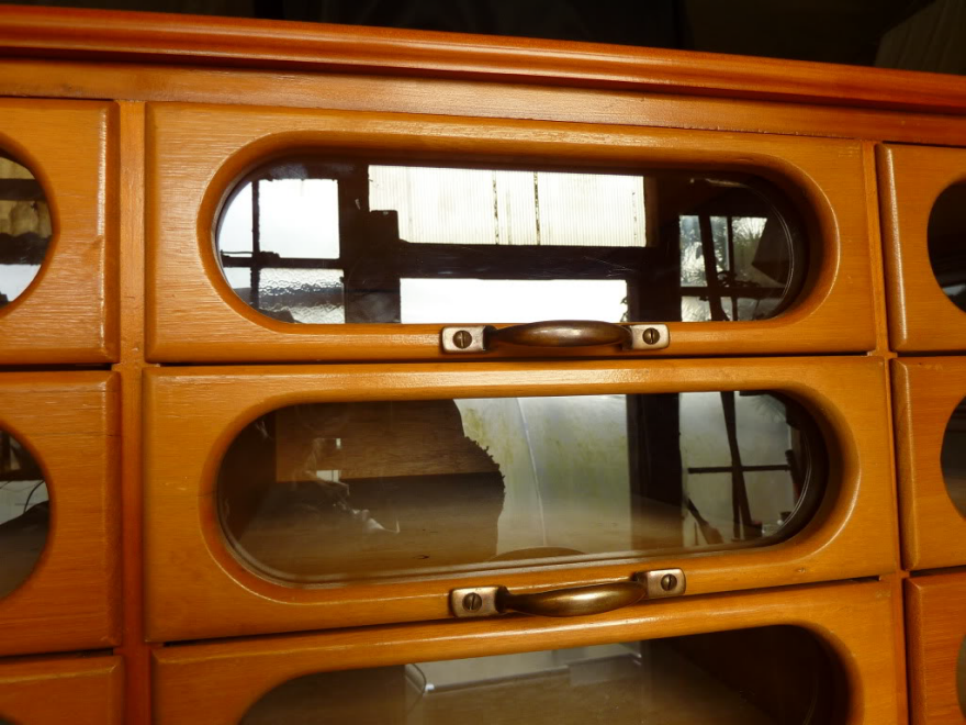
But it does address each of the three problems mentioned above. You would easily be able to see what’s within each drawer, and swiftly retrieve the item you wanted.
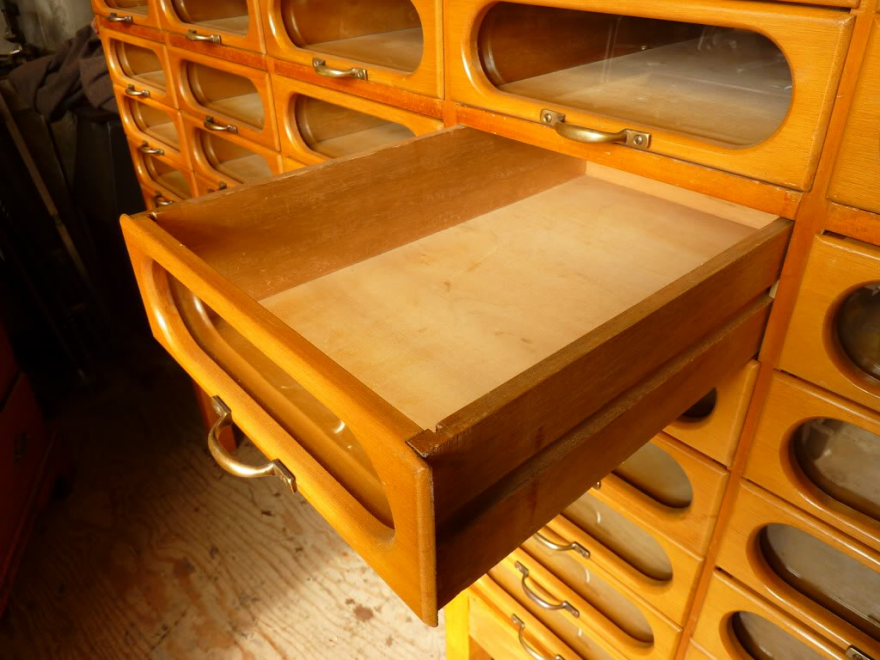
It’s not a perfect design, of course. We can see here that glare could be an issue.
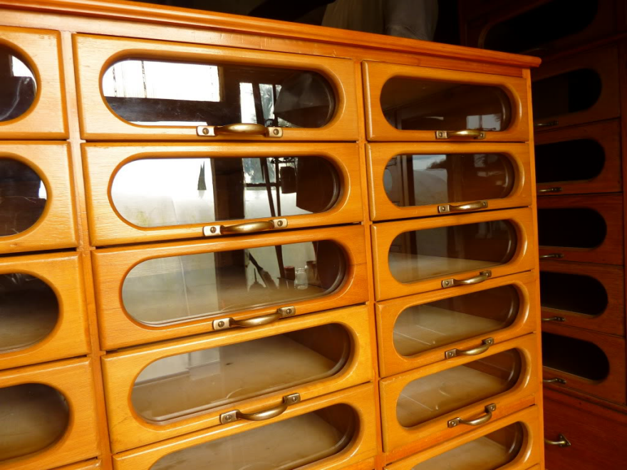
Not to mention that if had one of these and used it the way I’d prefer to, which is storing a single item within each drawer, that’s not exactly space-efficient. This unit here measures 69 inches high, 84 inches wide and 22.5 inches deep.
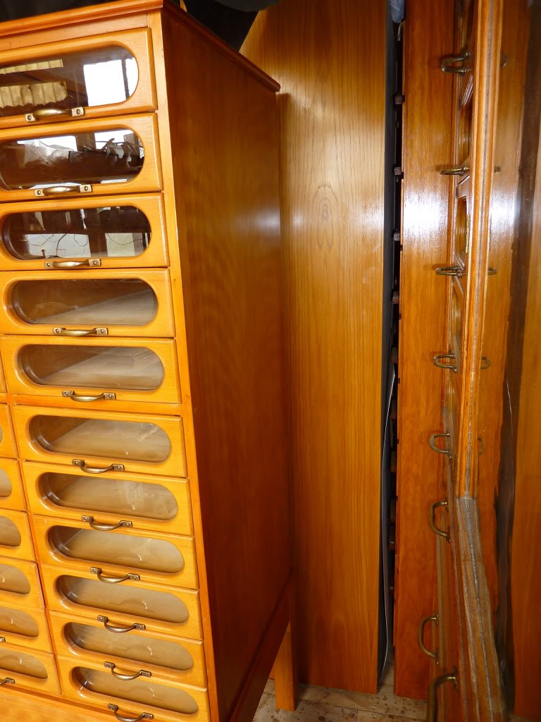
While the manufacturer is unknown, they obviously took pride in their work and paid attention to detail. Note the “clocked” screws on the handles, each arranged with their slot vertical.
As for why clothing dressers don’t look like this, the answer is obvious: It would be way too expensive to make them this way, from both a labor and materials perspective.
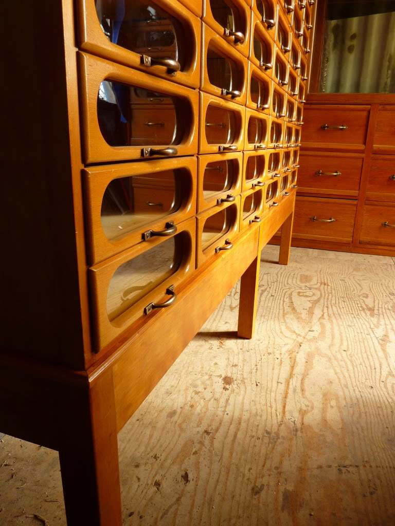
Speaking of cost, this model was up on eBay in the UK and sold for £2,995 (about USD $3,920).
http://www.core77.com/posts/54806/Unusual-Furniture-Designs-This-Haberdashery-Cabinet-is-What-Clothing-Storage-Should-Look-Like
