
#HTE
A Visual History of the Corvette Logo
Few American-made cars have inspired motor-headed children and teenagers like the Chevrolet Corvette. Originally introduced in 1953, the venerable ‘Vette has gone through seven generations of stylistic changes, and the current model would be unrecognizable to the crowds that flocked to see it at its debut 63 years ago. What do you reckon they’d make of the Corvette’s logo changes? And which is your favorite?
Original 1953 Design
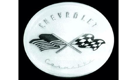
When Chevrolet was preparing their new Corvette sports car in the early '50s, the task of designing the logo fell to Chevy interior designer Robert Bartholomew. Bartholomew’s design featured two crossed flags: One, the checkered flag that symbolized race victory, the other, the American Stars 'n Stripes.

Last-Minute 1953 Re-design
However, using the U.S. flag for commercial purposes was illegal. Chevy execs nixed it just four days before the car’s unveiling; you can picture Bartholomew sitting at his drafting table going goddammit.) His last-minute replacement was a flag sporting both the Chevrolet logo and a fleur-de-lis, a French symbol that was reportedly part of Louis Chevrolet’s family crest.
1953 Actual Design
New badges were whipped up based on Bartholomew’s drawings, and the Corvette debuted in 1953 at New York’s Waldorf-Astoria hotel, sporting this badge.
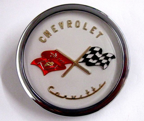
1956 Modifications
Bartholomew’s design stuck around until 1956, then underwent multiple tweaks and changes throughout the years. Amassing a photo list has proved trickier than expected, as there were multiple emblems for the hood, tail and fenders, but we’ve tried to put together a visual chronology focused on the nose badges. In 1956 and '57, the Chevrolet chevron was added to the design.

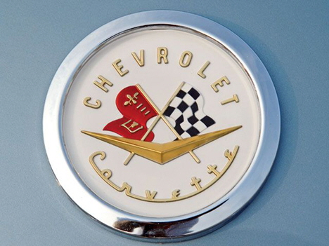
1958 - 1961
In 1958 we see a typographic update that persists until 1961.

1962
In 1962, the letters were removed from the circle leaving it more Spartan-looking.
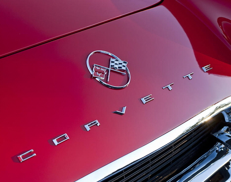
1962
The letters didn’t go far, by the way. They were simply taken out of the logo and spelled out on the hood of the car instead.
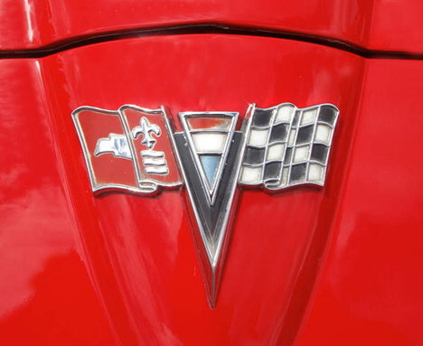
1963 - 1964
1963 brought an interesting change: The American flag is sort of snuck back into the logo (though the French would probably see a Tricolor). The circle is also dispensed with, as the logo is now shaped to follow the pointed “nose” of the new '63 body design.
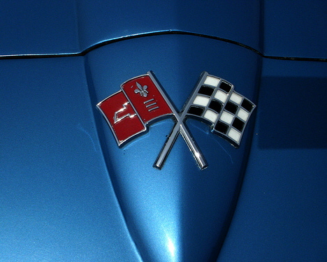
1965 - 1966
In '65 the logo goes even more minimalist, dropping the fluff and keeping just the flags.
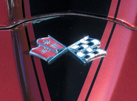
1967 - 1972
In 1967 the flags get an angle change, and the flagpoles each disappear into the bottom of the opposite flag. This reeks of cost-cutting and I find the design ugly. But it would remain the same until 1972.
http://www.core77.com/gallery/54649/A-Visual-History-of-the-Corvette-Logo