#HTE
I am yet to meet a person that doesn’t love a good (book)shelf. Just take yourself for example – do you love a good shelf? Of course you do, don’t be ridiculous. I’ve posted about my love of bookshelves and libraries a number of times in the past. This time I wanted to focus on a similar idea but in a slightly broader context. Today’s story focuses on shelving that’s more than just the name itself suggests. Top Shelf is an ode to joinery elements that play an integral part within interior architecture. Top Shelf acts both as a sculptural and a functional room divider, a hero of the room, a device which defines the space and renders it with it’s own unique character, and in some cases acts as a vertical linking device, or even as a staircase.
I think the reason there is such a strong collective love for bookshelves and shelves in general is the fact that books and objects can furnish a space better than furniture ever could. These objects infuse a space with a sense of familiarity and warmth, texture, colour, depth and character. In this progressively digital and intangible world we live in, shelving gives us the ability to display the real and the tangible. Top Shelf is the celebration of the analogue, and even if it was just for this reason alone, these joinery structures are becoming an increasingly important element within architecture and interiors.
See More ‘Stories on Design’ Curated by Yellowtrace.

Images courtesy of Ruetemple.
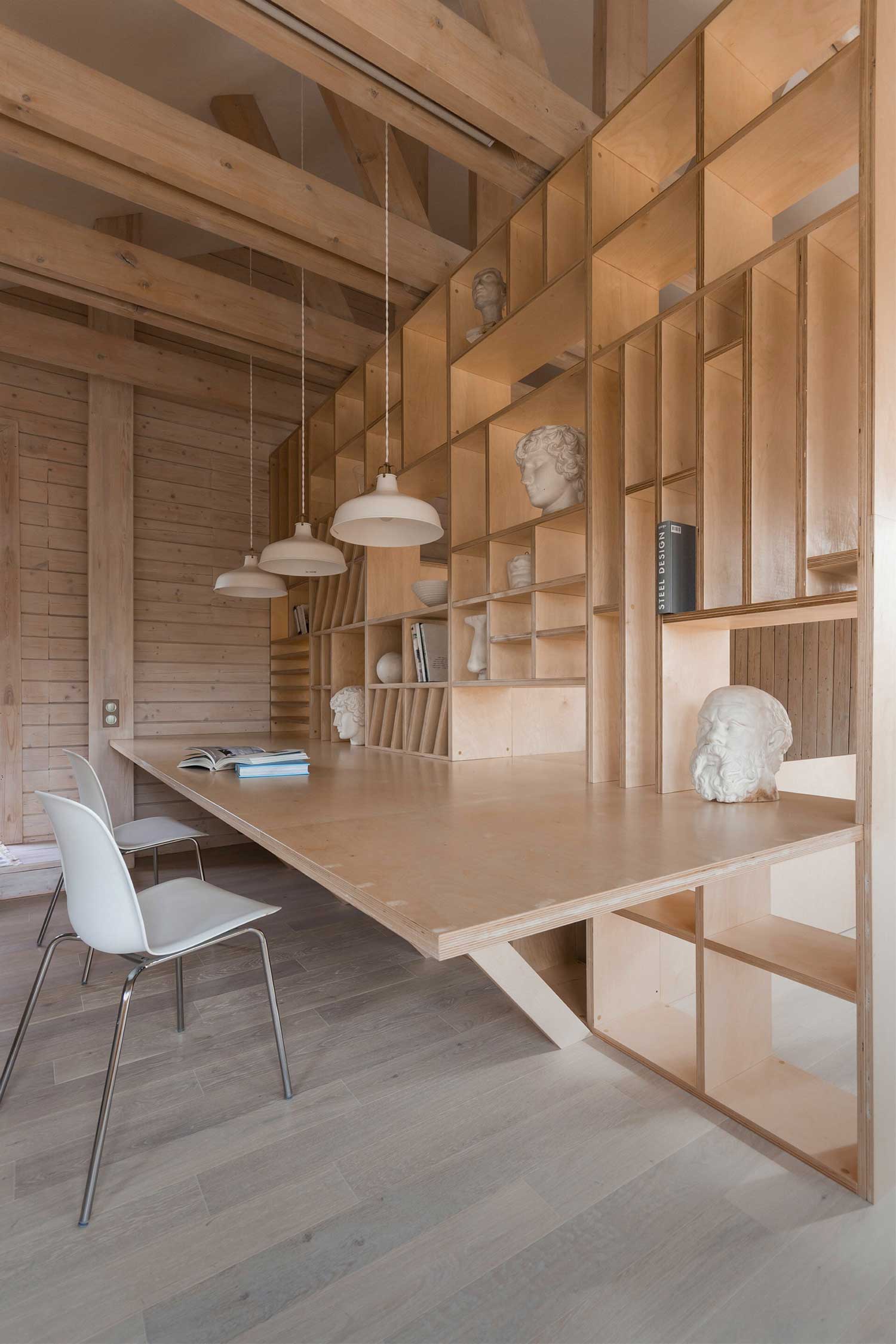
Architect Workshop by Ruetemple in Moscow, Russia // Inside this former garage interior, sits an arresting joinery setup which unifies the shelving, the work desk and a staircase all in one. Beautifully done.

Photography by Stéphane Chalmeau.
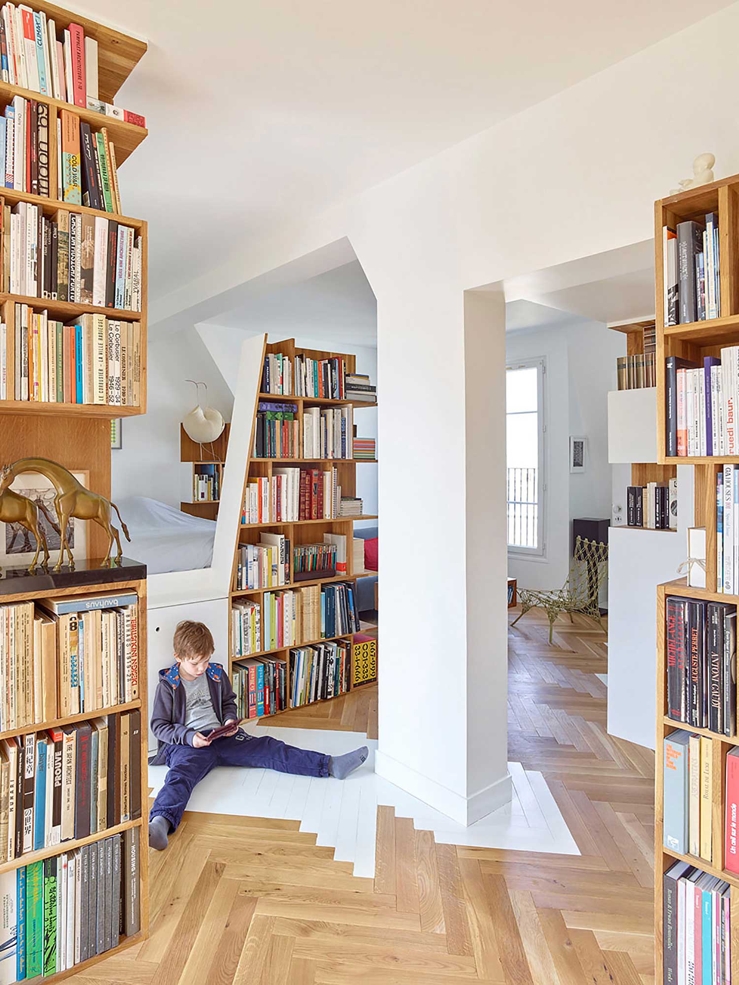
Arsenal Flat by h2oarchitectes // The project is articulated around three connected and sequenced living spaces which are defined in function of uses, light and multiple views. The common living space is open and partitioned by elements of furniture which have all been designed follow the sloping of the roof-line, forming a landscape of “totems”. These include bookshelves and diverse storage spaces which give this interesting apartment it’s own unique character.


Photography by Magic Penny.
Haitang Villa by ARCHSTUDIO // Located in the eastern suburbs of Beijing, this three-story townhouse was designed around the basic concept of using the changes within the materials and spaces to blur the boundary between indoor and outdoor, and to create an open environment that’s rich in layers. The design of the first floor (pictured) is developed around the living room and the study – oak grilles and shelving were designed to meet the requirements of the client, an avid collector of books, and to create a sense of layered semi-transparencies between the inside and the outside.


Photos by Koichi Torimura.
FIKA by ON Design Partners Tokyo // Designed by ON design partners, FIKA is a home that converts into a weekend shop selling scandinavian collectibles. Separated by a full-height white shelving unit, the shop and the home merge into a single space creating a unique and intimate shopping experience. Built on a corner block that measures just 35sqm (no, that’s not a typo), the house takes up approximately 58sqm over three floors.
Amazing, no? Next time I hear someone complain about how small their place is (including yours truly), I will instantly be pointing them in the direction of this project. Boom!
Read the full article about this project & see more images here.

Photography by Kenichi Suzuki.
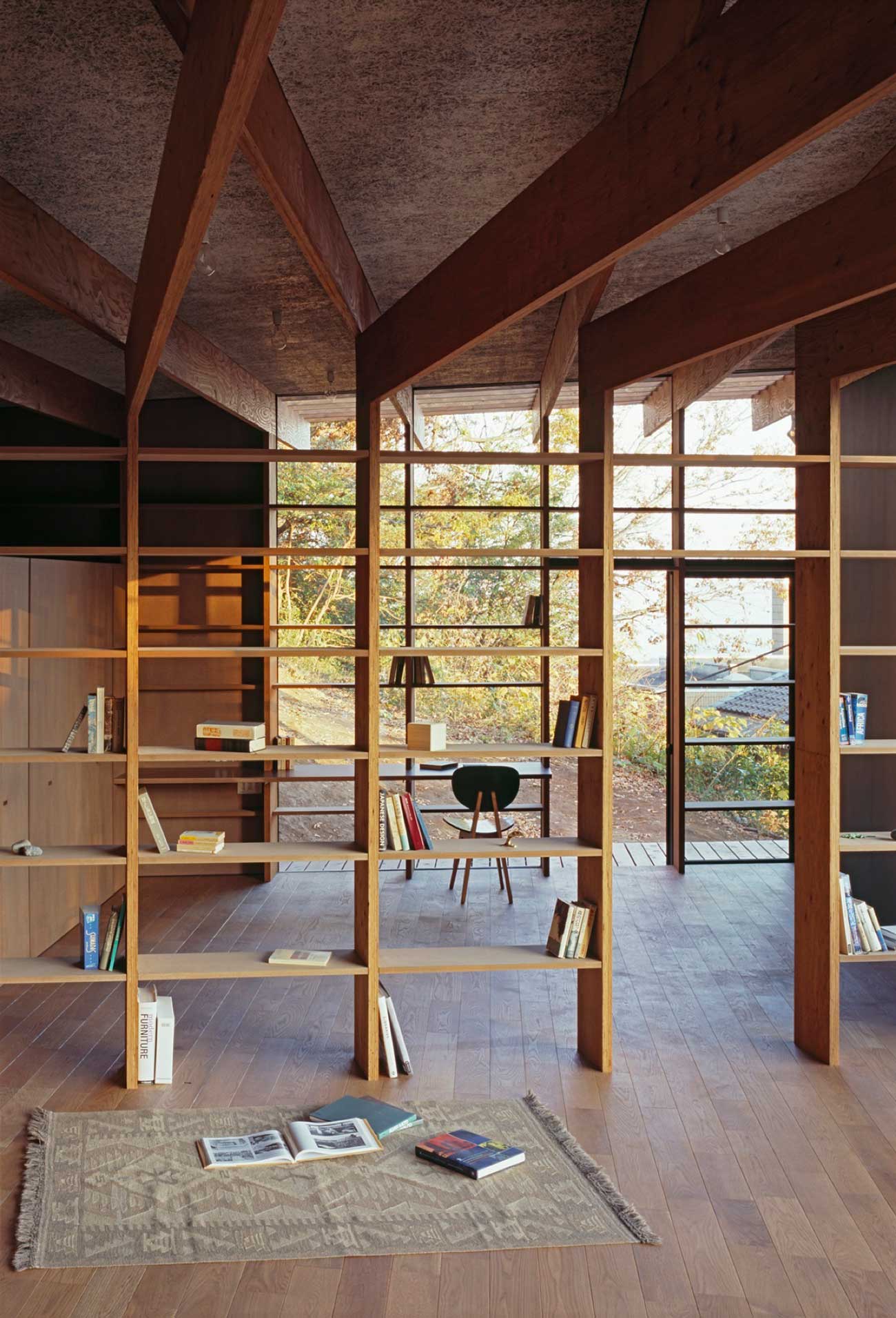
Geo Metria by Mount Fuji Architects Studio, Kanagawa, Japan // The planks of the roof beams fold down and divide the pavilion up into little open rooms. Bookshelves are slotted in between – how I love a room full of books. How I love ‘just enough’ spaces. How I wish I’d thought of this! The ceiling is jacked up so that the space opens to views out over the landscape below. It’s not a lot but it’s really beautiful.
Read the full article about this project & see more images here.

Photo by José Campos.
Loft Three Marias by AVA Architects // The designers chose to keep as much of the existing space as possible, preserving the apartment’s old timber floor and the existing layout of the rooms, with the added extension of two bathrooms. Harmoniously combining contemporary elements with the property’s history, including the elaborate stucco decorations on the ceilings, the designers have created an airy and calm living space that displays a sense of playfulness and humour.
Read the full article about this project & see more images here.


Images © CLS Architetti.
Penthouse Zurich, 2014 by CLS Architetti // The interior design of the duplex penthouse, conceptualised by Massimiliano Locatelli and Franca Sozzani, has radically transformed the space, making it flexible and adaptable to the client’s requirements. The project features large volumes faced with different materials that open and close to create an open space, or a more traditional home divided into rooms.
Read the full article about this project & see more images here.


Photography by FG+SG – Fernando Guerra.
Warborn Apartment by Caiano Morgado Arquitectos Associados // The project consists of a duplex apartment on the top floor of a sea-facing building. Walls and ceiling melt into one or bend in order to show the way. Similarly, the bookshelves play with our perceptions by opening up towards the window, creating distorted, playful perspective lines.

Photo by Shannon McGrath.
Alfred Street Residence by studiofour // Melbourne office Studio Four has used light American oak for the built-in furniture at this home in Victoria, which has been refurbished and extended to make it fit for a growing family. A wall of shelving surrounds the passage between the living room and the kitchen, resolving the difference in floor-to-ceiling heights between the old and the new part of the house.

Photo © Iwan Baan.
UNStudio Collectors Loft in New York // I have a lot of love for this loft in Greenwich Village in New York City, designed by Amsterdam-based UNStudio for a collector of modern and contemporary art. Breathtaking crisp sweeping planes that never seem to end, fluid spaces with soft ambient lighting, that clean ceiling (where are all the services hiding?), joinery growing out of walls creating space for the library and art display… I could go on and on. Beautiful stuff.
Read the full article about this project & see more images here.

Photography by Javier Callejas Sevilla.
Ficus Apartment by CUAC Arquitectura in Granada, Spain // The rectilinear version of it’s friend sitting above, this interior was also designed for a collector. The theatrical shelving extends to wrap the entire interior, while the black & white approach to colour adds to the spatial drama. Slick and clever.


Photography by Ricardo Oliveira Alves.
Casa na Rua de Sao Mamede by Aires Mateus Associados // 18th century castle Casa na Rua de São Mamede ao Caldas sits on a hillside in Lisbon, Portugal. Designed by Portuguese architects Manuel Rocha Aires Mateus and Francisco Xavier Aires Mateus of Aires Mateus Arquitectos, the historic estate has been restored to its former grandeur, including this sublime oversized shelf inside the home library.

Photography by Sid Siva.
The Pavilion Synopsis by Studio M in Dubai // Located in Downtown Dubai, The Pavilion is a dedicated non-profit contemporary cultural centre providing a place to view, discuss and participate in work by local, regional and international artists. The Pavilion is anchored by two gallery spaces and offers a library, lounge, restaurant, espresso bar and screening room. Freestanding bookshelves act as 3D transparent walls which control the views and access points between the corridor and the reading area.


Photography by Ken’ichi Suzuki.
Tree House by Mount Fuji Architects Studio in Tokyo, Japan // Located in a typical residential area of northern Tokyo, this home, designed for a young couple, sits in close proximity to it’s neighbouring homes. The problem with this was a shortage of natural light and privacy. To resolve this issue, the architects chose a ‘centripetal tendency’ by limiting the building horizontally. They selected the polar-coordinate-system as the geometry of the architecture instead of the cartesian-coordinate-system – each level frame was rotated and reproduced by 11.25 degrees and every frame is 55mm higher than the next one. I hope you got that cause I’m struggling. Anyway, The result is a sculptural interior which looks like a big tree.


Photography by Ken’ichi Suzuki.
Shore House by Mount Fuji Architects Studio // Ok, so we’ve already established that Mout Fuji Architects rock at designing homes which have an abundance of shelves within them (see project above + scroll up closer to to the top to see the other example). This project is no exception – an oversized shelf extends down the side of the entire interior, also forming a dividing screen at the back of the house. Genius.
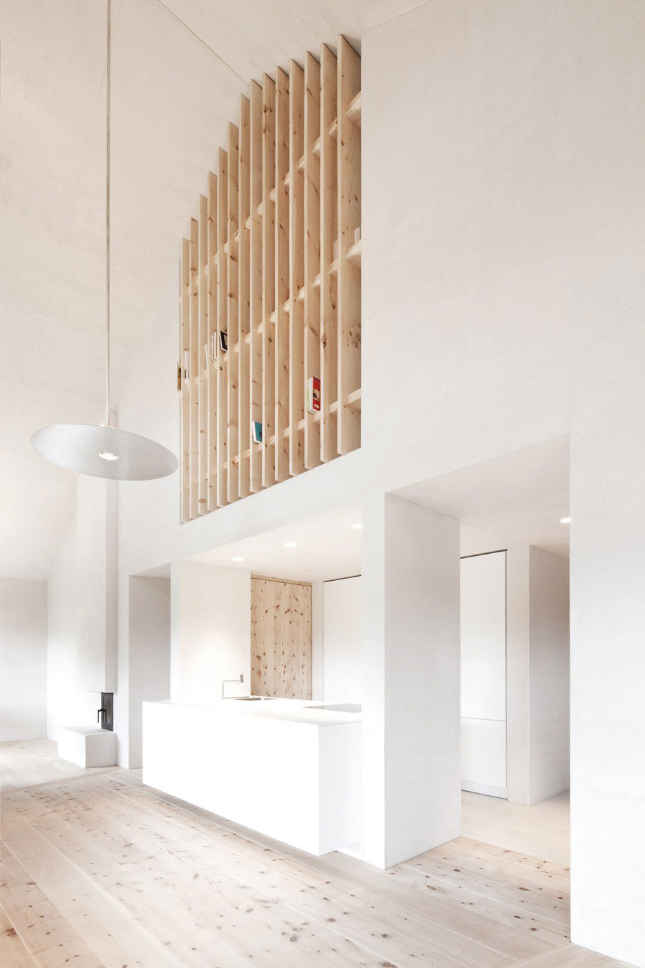

Images courtesy of Pedevilla Architekten.
Wohnhaus Pliscia 13 by Pedevilla Architekten // Wohnhaus Pliscia 13 is a private home designed by Pedevilla Architekten, located in San Vigilio di Marebbe, Italy. Regional ornaments and characteristic features, such as a gabled roof, a porch and timber façade are used throughout the hose as a reference to the vernacular architecture. The interiors is minimal and bare, and the inclusion of a single pine bookshelf (or are we better off calling it a screen?) provide a quirky little moment which I personally adore.

Photo by Takumi Ota.
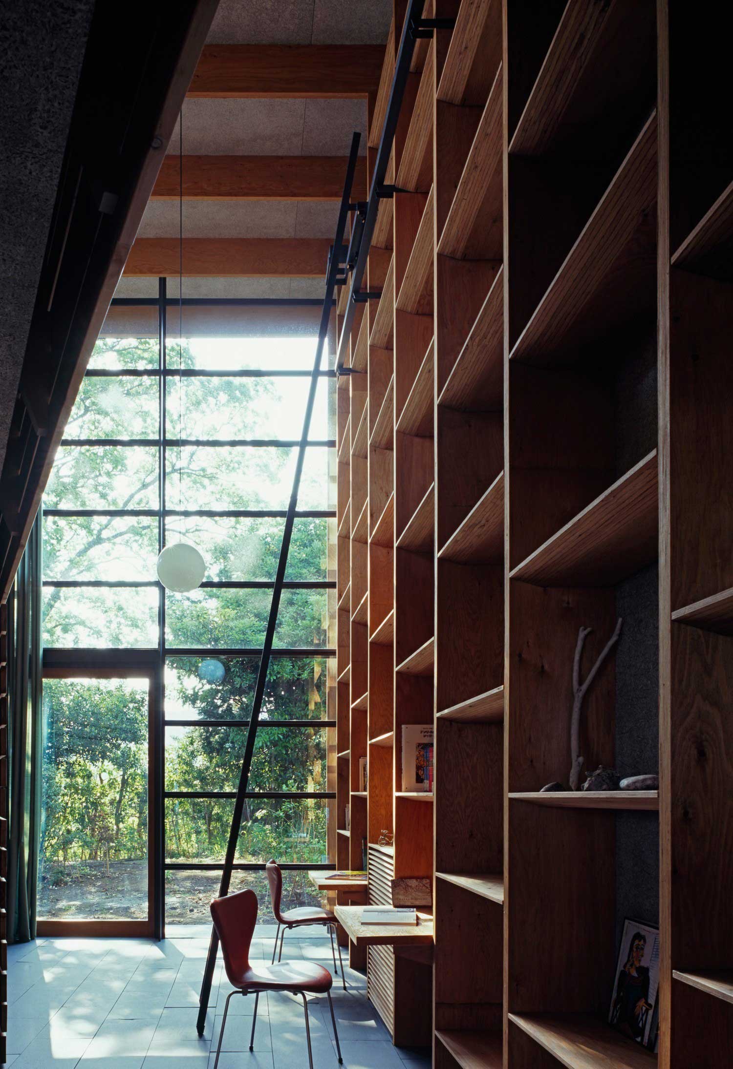
Storage House by Ryuji Fujimura Architects // A timber shelf climbs the walls of this four-storey house in Kanagawa, Japan. Starting in the basement, the first set of bookshelves are a storey high, while a second set begin on the first floor and rise up to reach the ceiling of the floor above. A mixture of both concrete and steel staircases connect the levels inside the house, while ladders provide access to a second floor loft and to the highest bookshelves.


Photography by Earl Carter.
Green House by Sean Godsell Architects // This suburban home in Melbourne, Australia, was once a small timber cottage which has been adapted and redesigned by Sean Godsell Architects. The interior of the existing house was remodelled and a new addition built. The architects introduced a cathedral ceiling, with a simple white shelf in the kitchen following the lines of the architecture.
The post Stories On Design // Top Shelf. appeared first on Yellowtrace.
http://www.yellowtrace.com.au/top-shelf/

