At Home Studios second hotel project, Alsace LA, a unique 2,000 sqm 48-room boutique hotel designed in collaboration with NMDA Architects and CIM Development, the New York natives celebrate West Adams—a Los Angeles neighbourhood rich with architectural history and artistic tradition.
The purpose-built property reflects Home Studios’ devotion to details and narrative-driven approach to design, which has resulted in a space that feels both of the neighbourhood and continually open to evolution as the community expands. Best known for the distinctive look and feel of their hospitality projects, Alsace LA translates the most memorable and eye-catching aspects of Home Studios restaurants into a luxe, retro-inspired design destination.
The designers found inspiration in West Adams’ varied architectural tradition; the influx of a young community of artists and entrepreneurs; and the warm textures and materials of the Mediterranean—a region that shares a kindred spirit to Southern California in both climate and energy.
The hotel’s interior design highlights the power of visual storytelling, riffing on charming elements like soft curves, white oak ceilings and floors, and site-specific art. The sweet and layered details—including the eclectic use of vintage and custom Home Studios furnishing and lighting; fluted textures; Terracotta plaster; and warm wood materials—subtly reference California’s diverse vegetation and natural environment.
Upon entrance to the 48-room boutique hotel, guests are greeted within an intimate and tucked away lobby, which mimics a Mediterranean-like portico. Residential in feel, curved walls and central courtyard filter light through each of the hotel’s three stories, where the serene and inviting rooms provide guests with congenial and homely amenities as if staying in a well-curated residence.
Each 21sqm guest room features handcrafted details, while larger suites include a balcony or terrace, a custom dining table, and a bespoke pull-out sofa—blending the charms of old-world travel with new-world comforts. Additionally, Home Studios designed custom furniture for each light and airy room, including upholstered headboard panels, rattan and wood wardrobes, and sculptural brass hooks, transporting travellers to a warm oasis amid a dynamic and energetic urban resurgence.
With an emphasis on the unexpected, the hotel is a one-of-a-kind space, made culturally relevant with contemporary art, photography, and playful design details that incorporate subtle references to European antiquity by way of local craft.
In the lobby, a tile mural, developed in collaboration with local LA artist Lukas Geronimas Giniotis, draws on themes of ancient mosaic art, featuring figures in repose amongst an abstracted landscape of fauna and classic architecture. Like scenes from mythology, each of Giniotis’ tile motifs hints at the use of space throughout the hotel’s common areas—divers near the exit to the pool, figures playing near the gym, and bodies ascending stairs.
Home Studios’ ongoing commitment to bringing a personal touch to their projects has resulted in a destination built for leisure-seeking travellers and Los Angeles residents alike.
Nel Verbeke is driven by the emotional power of design. More than by the form or function of objects, Brussels-based designer’s practice is defined by in-depth research, looking both at the past and the future and critically reflecting on the current zeitgeist. Her work manifests as situations and objects that question and transform our relationship to ourselves and to what surrounds us.
The last time we encountered her pieces (outside of her work with Brut Collective), Nel was exploring how design can allow for moments of melancholy – a concept that’s only aged more poignantly. Now she’s back with a new exhibition at Artcetera in Brussels on “The Architecture of Time”, aimed for circumstances that intensify our engagement with time, space and the objects within.
Through this research, Nel suggests a moment in itself deserves its own architecture; to sit and shelter in that momentary presence, separating it from the ever accelerating rhythm of life. A thought she further develops through the idea of ‘niches’, architectural cavities in walls that have a spiritual rather than a functional value, and are historically and interculturally linked to the withdrawal from pragmatic existence and the ever-urgent quest for (self-)insight. She reinterprets them as free-standing alcoves that articulate the trajectory of daylight or makes them the outcome of a dedicated gesture.
Nel’s choice of materials also refers to the notion of time—copper refers to ancient traditions and antique artefacts, or the dug-up soil of a specific place, layered throughout history and marked by the seasons.
These works grant us an awareness of the passage of time, creating spaces for introspection and contemplation and invite us to pause and embrace the emotional ambivalence of our existence rather than resist it. It’s always a pleasure to enter Verbeke’s world— even if just for a fleeting moment.
It’s no secret we’re pretty crazy about bricks over here. The humble building material has not only shaped Australia’s vernacular, it’s also a vessel for cutting edge technologies and a driver of innovative design. Durable, sustainable, recyclable and beautiful, Bricks stand the test of time with benefits that are unrivalled by other building materials.
Brickworks, Australia’s leading manufacturers of quality building products is paving the way to a more sustainable future. “Brickworks’ ethos is to create beautiful products that last forever,” says Brett Ward, General Manager of International Marketing at Brickworks. “This philosophy is centred around the premise of sustainability and environmentally conscious and responsible design.”
The company’s latest sustainable initiative—Climate Active Certification—brings with it excitement and a sense of renewed optimism. In a nutshell, this government-backed program helps businesses reduce their carbon footprint and prove they’ve achieved net-zero emissions. The process sees businesses working alongside Brickworks to integrate sustainability and climate-sensitive design into their projects.
This Yellowtrace Promotion is supported by Brickworks. Like everything we do, our partner content is carefully curated to maintain the utmost relevance to our audience.
Customers, construction partners, design professionals and developers can now procure any brick or paver made in Brickworks’ Australian facilities as a certified carbon neutral product. To achieve this latest certification, Brickworks engaged Energetics to conduct a full carbon audit of processes nationally. From this, they’ve produced a carbon calculator for each brick and paver product.
Brickworks explain the process as demonstrating a “cradle-to-grave life cycle analysis including extraction of clay, manufacture, delivery to client and disposal at end of life. From here, Brickworks pre-purchases carbon credits to offset carbon footprints. This allows full design flexibility for consumers and designers, offering them an array of Brickworks’ products with the ability to offset carbon emissions for a lower embodied energy and a minimised carbon footprint.”
“Breathe were early signatories to Architects Declare Australia, which is an acknowledgement that we’re all facing the twin threats of climate change and biodiversity loss. So we’ve been really vocal advocates, appealing to the broader industry to go carbon neutral. It’s energising to see the expanded carbon-neutral offer by Brickworks and I hope to see more industry leaders and suppliers coming to the forefront, and matching this challenge.”—Bonnie Herring, Director of Architecture and Sustainability, Breathe
“It is incredibly important that we are all starting to design more sustainably, using materials that have low embodied energy and responding to the global crisis that is on our doorstep. We saw it as imperative that we became carbon neutral and got certified. There is a growing market for people wanting to live more sustainably. The carbon-neutral offering from Brickworks is fantastic because it now provides architects with even more appealing reasons to go down the pathway of sustainable design.”—Tristan Wong, Director, SJB
“There’s something really robust, beautiful and almost ancient about bricks – a reminder to stay grounded in nature and remember the homes we build, or the buildings we work and play within are always connected to the earth. Brickworks has always been a leader in this space and so we’re really excited about the Climate Active carbon-neutral certification. We’ll definitely be running all of our projects through that process, because it’s in alignment with our values – we couldn’t be more passionate about sustainability and contributing to a regenerative environment.”—Monique Woodward, Director, WOWOWA
Architects and other construction partners are seeing major benefits of obtaining this certification as the appetite for sustainable living grows. Go Carbon Neutral with Brickworks initiative is supported by industry-leading architectural practices including SJB, WOWOWA and Breathe. These like-minded leaders are not only pioneers of brick but share a passion for sustainable design as they navigate their own carbon neutrality.
Tristan Wong, Director at SJB, highlights the relevance and pressing need to be involved in this Climate Active campaign. “The urgent and ever-present reality of our carbon footprint defines SJB’s purpose to lower our environmental impact and design solutions for a more equitable and sustainable future,” he says “The certification and new offering from Brickworks encourages designers, builders and everyone in the built environment to be thinking about how materials can positively contribute to environmental and social outcomes while also adding value to their buildings.”
At Stoney Rise Wine Cellar Door, Cumulus Studio use of brick is both functional and sculptural. Using the laying pattern as a feature, along the wall next to the bar, extruding bricks, acting as a small shelf, each perfectly displaying a Stoney Rise bottle of wine. Cumulus Studio chose a combination of both Bowral Blue bricks, and locally sourced Daniel Robertson bricks. This materiality grounds the building and offers a thermal mass for the cooler Tasmanian winters, as well as being extremely durable. Photography by Anjie Blair.
Brickworks is committed to building a sustainable legacy now and always and this latest Climate Active certification is not the only one that they’ve received. In 2014, the Daniel Robertson range —manufactured out of the Austral Bricks Longford, Tasmania operation— achieved carbon neutral certification. In doing so, the company significantly reduced their carbon footprint and offset the remaining emissions.
Brickworks has also launched a new sustainability strategy, ‘Build of Living: Towards 2025’ following extensive stakeholder consultation. The strategy sets a clear pathway with measurable commitments to ensure that Brickworks continue to have a positive environmental and social impact.
WOWOWA’s Merri Creek House features large curved walls, a sweeping staircase and, of course, its signature cylindrical towers. The architects chose a textured carbon neutral brick for the groundbreaking private house because of its aesthetic appeal, sustainability and enduring strength. “We worked closely with Brickworks to choose exactly the type of material that would enhance our design,” says Monique Woodward, co-founder of WOWOWA Architecture. “We selected a combination of Daniel Robertson Traditional bricks and Allure bricks from the Austral Bricks range.” Photography by Shannon McGrath.
It’s clear that we need to come to terms with the profound impact we have on our planet. Reducing emissions, promoting biodiversity and mitigating operational effects is of paramount importance for any business. This is one of the most critical issues of our lifetime and we can all be part of positive change. Whether you’re just starting your carbon offset journey, or are actively looking for new and innovative ways to be more environmentally sustainable, Brickworks can help. Register for Climate Active today and go carbon neutral. Our future depends on it.
Situated in Truganina, within Wyndham’s rapidly expanding northwestern growth front, Mainview Boulevard Family Learning Centre provides family services and spaces for the surrounding community. Comprised of a series of sweeping forms and a central circular atrium, Canvas Studios chose Daniel Robertson bricks in Hawthorn Cambridge & Surrey. Photography by Peter Bennetts.
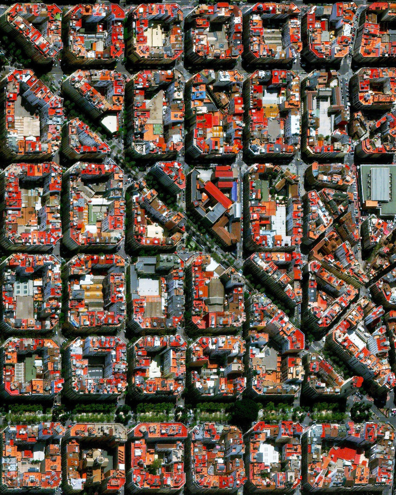
The urban plan of the L’Eixample district in Valencia, Spain, is characterized by long straight streets, a strict grid pattern crossed by wide avenues, and apartments with communal courtyards. A similar layout was used for the district of the same name in Barcelona.
Cape Town is a port city on South Africa’s southwest coast. The city’s geography is influenced by the surrounding Table Mountain, Durbanville Hills, and the expansive lowland region known as the Cape Flats. These geographic features divide the city into several suburbs, many of which developed simultaneously and share common attributes of language and culture. This unique blend has made Cape Town one of the most multicultural cities in the world, attracting tourists and immigrants to South Africa.
Located in Bayside, Melbourne, Bayside House is a refurbishment of a questionable extension that’s been added to the original Victorian house. This collaboration between McCluskey Studio and Cera Stribley also marks the debut for McCluskey Studio – headed by director Kate McCluskey who worked closely with Cera Stribley’s project architect, Matt Hainsworth and Leone Constructions. The end result craftily pulls vintage essence from the façade and translates them into sleek modern accents found within, with spaces made so grand, one could easily think they walked into a luxurious showroom.
A project almost three years in the making, the brief called or a transformation of the ‘poorly conceived’ existing extension and for the house to become a ‘showpiece family home’ that celebrates minimalism. The ambitious brief led to a remodelling that starts from the existing corridor, swooping gracefully upwards to encompass new bedrooms and bathrooms subtly distributed over two storeys. The renewed addition hugs the Japanese courtyard, landscaped with deep greens to compliment the dark steel framework and roof of the glass installation. A transparent surface, it exposes the bricks of the existing house, still preserved with patches of paint too precious to erase.
Under the client’s request for a deeper palette — symphonies of sturdy lines, unwavering marble and black finishes block themselves around the space. Brilliant cool white stretches itself against new and existing walls, existing floorboards are revived with a deeper stain, and soot marbled tiles or plush charcoal carpets are introduced for the new flooring.
Each room has been curated to exude the qualities of a gallery. A boxed kitchen attached to the extension is framed with bespoke dark stained-oak cabinetry carefully pressed against the island bench topped with Ibiza White marble and a glazing splashback that reveals the garden beyond. A display of Turkish Marble can be found in the master ensuite, lined in stone from the bathtub to the vanity bench, and to the bench in the curved marble subway tiled shower. Elsewhere, bringing architecture and interior poetics together, bedroom joinery dutifully fits in with fluid curves of the walls while playful pendant lights dangle carefully to compliment both the new and existing ceiling embroidered with floral carvings.
The front of the house is added with new touches to fully unify the heritage and the present. Former timber doors are replaced with sleek ebony steel-framed doors to complement the bay windows in the front rooms. Adorned with bold artworks and bespoke joinery, the space is now regarded as an enviable lounge and library for the client’s family.
An adventurous brief allowed for adventurous outcomes, Bayside House demonstrates a dynamic effort between the client, designers and builder. Each space — by sharing a common language while still introducing a different character — makes the architecture a unique and special one.
Loosdrecht is a town of roughly 8,600 inhabitants in the North Holland Province of the Netherlands. It is known for its lakes, the Loosdrechtse Plassen, which attract thousands of tourists each year. Surrounding these lakes are hundreds of peat polders — low-lying pieces of reclaimed land protected by dikes, around 4,000 of which exist in the Netherlands.
YSG Studio has transformed a late 19th-century Victorian Georgian corner shop in Sydney’s Rozelle into a family-friendly home for four. Preserving the historical character of the existing framework, this three-storey sandstone family abode was revived with an adroit telescoping of eras and artistic influences. Within, bold hues and textures harmoniously mingle with whisper-soft sensuality.
Intent on colonising open space, YSG removed all original joinery and furniture to create a combined kitchen, dining and living area in the original shopfront. Furnishings and fixtures subtly reference Charles Rennie Mackintosh’s delicate Art Nouveau flourishes and the quiet restraint of timber framing devices take heed from traditional Japanese interiors. In totality, the project took three years to complete, due to council approvals and meticulous structural alterations to maintain original features.
Just as all monumental stars need a great support act, tactile finishes and textures play to the splendour of the stone walls. They softly intervene to avoid strong contrasts between old and new, enhancing original features instead. Wooden frames are the reassuring embrace, taking inspiration from shōji. A deep threshold of ebony-stained American Oak highlights the theatre of the dining room like a proscenium arch – subtly acknowledging the outlines of the removed wall. Two gloss-finished solid timber orbs secure the armature on either side, concealing exposed fixings to the surround. This angled arc concept is gently echoed in a bedroom, aesthetically framing walk-in-robe joinery whilst serving as hanging apparatus. Within the master suite, timber frames the wardrobe and bed like tatami matting. Emanating a pearlescent glow granted by textured vintage seagrass wallpaper, a mood of luxe seclusion is enhanced. Similarly, the kitchen’s under bench joinery hovers within a framing device of latticed timber while the island bench is offset by lithe vertical supports under the heft of leathered quartzite.
Exploring the ethereal application of timber further, a rectangular halo of Australian Red Cedar with blunted corners hovers from the void above the dining table LED’s of this custom-designed piece articulates its underside. The carved Poplar Burl cups, inspired by Venetian Barovier & Toso chandeliers, ignite interest towards the upper level. A myriad of fabrics in nubby wool textures and silky finishes complement the matte and sheen characteristics of the pitted walls as sun and shadow play upon them. They range from the soft bark-like texture of the framed antique batik fabric of the shōji in the lounge to the shimmer of the frayed oyster grey silk bedhead in the master suite.
Spaces swell and expand through pattern integration. The square macro outlines of the floor pavers sync in miniature scale with the master ensuite’s mosaic tiles and the salon’s lilac open weave linen curtains, enhancing flow.
Within the main bathroom, the horizontal bands of rose-tinted limestone tiles grant the illusion of sunlight streaming within. Tactical mirror placements visually amplify dimensions and bounce natural light throughout.
Hard angles are softened via the inclusion of rounded tables, upholstered furnishings, undulating surfaces and carved nooks including the live edge timber shelving in the lounge and display ledge running the length of the room above the seating perch. The gentle bulge of the hemp-rendered wall supporting the ledge adds cossetting comfort, as minimalist adaptations of wainscotting boost the Victorian appeal in the sleeping quarters.
Through an elegantly radical palette and flowing interior, YSG’s clever transformation of the late 19th-century corner shop has created a comfortable and indulgent family home. Retaining the buildings historical essence, the seemingly odd pairing of Art Nouveau elements and Japanese traditions bridge the divide between heritage and contemporary styling, resulting in an entirely new kind of aesthetic. Kudos.
A hybrid exhibition and research space has come into full bloom in the southernmost city of Hainan Island, China. Sanya Farm Lab, designed by Beijing-based CLOU architects, is a multipurpose infrastructure interlocked with ties between traditional and modern—as well as society’s shifting attitude and support for a better connection to nature.
Sanya Farm Lab is based in Nanfan High Tech District of Sanya—a district known for its seed development. The client brief for the new hub was developed to accommodate the government’s interest in creating a building to foster research on tropical plants, in addition an investigative space specifically for the research of “environmental change, land/water scarcity and food production issues”. Added with the growing interest in the desire to connect with rural life (I mean, have you seen Li Ziqi’s videos?!), as well as in increased popularity in rural tourism.
The architects designed an impressive 4,000-square-metre four-storey building that blurs the principles between research and social; and indoor-outdoor relationships. The overarching scale was achieved through three stages—stage one involved establishing the perimeter of the outdoor spaces within the building, followed by creating interconnections with accessways before completing the third with a breathtaking timber façade to enclose the facility.
Across each level are different activities that allow effortless interaction between visitors and agricultural display. The ground floor is filled with vertical farming and other rural showcases, with kitchen and bar allowing visitors to enjoy farm-to-table cuisine. Travelling upwards, connected by a statement spiral staircase, is a cantilevering first floor serving as a multipurpose theatre and discussion space that offers terrace views towards the north. The second and third is a playground terrace for children to enjoy and appreciate the framework of the impressive structure. Across the ground to third floors, office and back of house spaces station themselves in the northeast end of the floor.
To further the relationship between nature and people within the science building, micro landscapes dot themselves as implied boundaries for programs and wayfinding across each level. Ambitious vertical gardens—though planted on the ground floor—manage to stretch themselves into the discussion space on the first floor. Similarly, a void is punctured through the very same level allows for a tree to grow while being managed by agricultural robots.
Additional ties to nature and heritage are subtly made through the exterior façade. The gridded tectonic framework of 800mm thick laminated timber veneers infilled with grid-patterned frosted glazing is inspired by the architecture of local Hainan Li people. Such ties are also a conscious design to maintain the climate inside—for it reduces the solar intake while leaving the aesthetic refreshing and innovative.
As someone with a fascination for indoor plants, I’d be keen to take lessons from this building. There’s an impressive architecture to admire, and open spaces to socialise and learn from. Added the opportunity to take a break from the city life in a contemporary context, it makes this contemporary greenhouse an attraction plant enthusiasts wouldn’t want to miss.
Designed by Naoto Fukasawa for Artemide, Demetra Table Lamp is inspired by the Greek goddess of the harvest. Its ingenious combination of flexibility and seamlessly sleek design make Demetra an ideal choice for productive environments like business or home offices.
An extensive family of table, floor, and wall lamps, Demetra embodies full functionality.
Legendary Japanese industrial designer Naoto Fukasawa with Demetra.
Designed by BIG, La Linea is a flexible tube of light, capable of freely twisting and turning in space according to undefined geometries. Suited to indoor or outdoor spaces, La Linea can be highly expressive by folding three-dimensionally or alternatively following linear elements of architecture to emphasise the design of buildings and interiors.
Designed by Ludovica + Roberto Palomba, Arrival is a complete lamp family with dynamic, flowing shapes that sculpt light with delicate, graphic lines. Effective as a standalone object or combined in a group with the different versions, Arrival is also available in table and floor lamp versions.
Tolomeo, Tizio, Shogun, Demetra — sound familiar? No lighting brand looms quite as large as Artemide. Since being founded in Milan by Ernesto Gismondi in 1960, the brand has been responsible for some of the most iconic pieces of contemporary design.
In fact, it wouldn’t be an overstatement to say that Artemide lights are specified on most architecture projects I work on. That’s because their collection of world-class pieces are suitable for every room and every need, striking a balance between form, function, innovation and efficiency.
The brand’s design philosophy ‘The Human Light’ places the human experience at the forefront and creates an ‘illuminated companion’ that makes a tangible contribution to daily life. With a laser focus on design and innovation, Artemide products originate from research and high-quality manufacturing.
This Yellowtrace Promotion is supported by Stylecraft. Like everything we do, our partner content is carefully curated to maintain the utmost relevance to our audience. Thank you for supporting the brands that support Yellowtrace.
Welcoming Artemide to Stylecraft, the Sydney showroom windows were transformed by Susan Standring and Matt Sheargold of STUDIOX3 with a series of artists vignettes. Photographed by Rowland Reyes Martinez / Edited by ar-chive studio.
Artemide’s Yanzi collection detail at Stylecrafy Sydney. Photographed by Rowland Reyes Martinez / Edited by ar-chive studio.
Stylecraft Melbourne windows were also transformed by Susan Standring and Matt Sheargold of STUDIOX3 to welcome Artemide. Photography by Haydn Cattach.
Detail of Stylecraft Melbourne windows for Artermide, featuring Chlorophilia pendant.
Artemide Design Collections are now available in Australia and Singapore exclusively through Stylecraft. Building on their growing collection of design pieces — Artemide’s expansive range of wall, table, floor and pendant lights now provides the opportunity for designers to source complementary pieces to Stylecraft’s furniture collections.
In welcoming Artemide to our shores, Stylecraft showrooms in Melbourne and Sydney had their window displays designed by Susan Standring and Matt Sheargold of STUDIOX3.
“Inspired by the theatrical staging of a diorama, the windows are playful and whimsical, providing fresh narratives for both new and classic Artemide fittings,” explains Susan Standring. The aim of the windows was to engage onlookers both internally and externally, with a touch of Milanese flair.
The Dalù Table Lamp, designed by Vico Magistretti in the 1960s for Artemide, is a re-creation of the unmistakable original, translating the ethos of the swinging sixties and psychedelia into the current day.
An icon of Italian industrial design, the Eclisse Table Lamp was originally inspired by a miner’s lamp used by the hero Jean Valjean in Les Miserables. Designed by Vico Magistretti in 1967 for Artemide Design, the Eclisse is an avant-garde balance between form and function, design and utility.
Also by Magistretti for Artemide, the Teti Ceiling Lamp is simple, highly original and supremely functional. Originally launched in 1967, the rounded base and conical form somewhat resemble a chess piece with a single bulb at the tip. Available in Anthracite, White, Orange or Transparent finish options, the compact lamp exudes style from the ’60s while still remaining relevant in settings today.
For more than 60 years, Artemide has focused on understanding how people interact with light, resulting in an offering that combines beauty and functionality.
The following designs chart their journey from iconic ranges such as Tolomeo, Tizio and Shogun, to Artemide’s new collections including Laguna, Yanzi, nh and Gople.
Let’s dive in.
The Tolomeo series, designed by Michele De Lucchi and Giancarlo Fassina for Artemide in 1986, is recognised by designers and architects around the world as a perfect marriage of engineering and design. Perhaps one of the most iconic lighting collections ever made, the Tolomeo remains as relevant to various settings today as it was over 30 years ago. The Tolomeo Floor Lamp is also available in various wall, floor and suspension options.
Tolomeo is also available in vibrant pops of colour in the Bicolour version with blue, coral and white options added to accent the black base.
Oh, Tolomeo! Perhaps one of the most iconic lighting collections in the world, the Tolomeo is as relevant today as it was over 30 years ago. A magnificent combination of balance and movement, engineering and design, the collection of table, floor, pendant and wall lamps was designed by Michele De Lucchi and Giancarlo Fassina in 1986.
The Tolomeo table functions as a task lamp and a sleek design object with a fully adjustable arm to direct light. To further control the quality of light, options include a dimmer switch incorporated in the head as well as a motion sensor for energy consumption and tunable white LED technology to adjust the colour temperature. The Tolomeo Floor Lamp combines the body of the Tolomeo table lamp with a floor standing support. Tolomeo pendant also features the same arm balancing system as the table lamp but with an adapted mounting system that’s available in double suspension with or without a shade. The Tolomeo Wall Lamp has a surface or j-box wall support and comes in various sizes including classic, micro, mini and mega, with options of parchment or fabric shades.
As an icon of Italian design, the Tizio Table Lamp graces the permanent collections of The Metropolitan Museum of Art and the Museum of Modern Art in New York amongst the most celebrated icons of modern lighting. Designed for Artemide by industrial designer Richard Sapper in 1972, the sophisticated principle of fully adjustable balanced counterweights, lack of wires, and electrical conductor arms have made Tizio an illustrious award-winning design of the 20th century.
Another icon of Italian design is the Tizio. Designed by industrial designer Richard Sapper in 1972, Tizio is a sophisticated display of aesthetic and functional balance. “The lamp is built with two counterweights allowing the user to direct the light at will. The lamp adjusts with a pull or push of the hand and stays in place as set. Eliminating the need for extraneous wires and enhancing a clean aesthetic. A small reflector works with the light source to provide highly concentrated light,” explains the designer. Tizio is available in a table and floor version.
This notable, award-winning lamp is in the permanent collections of The Metropolitan Museum of Art and the Museum of Modern Art in New York. “It stands proud amongst the most celebrated icons of modern lighting, effortlessly blending function with style.”
Designed by Mario Botta for Artemide in the 1980s, Shogun is now classed as a design icon – also forming part of the Metropolitan Museum in New York’s collection. The structure of perforated steel creates beautiful plays of light and shadows that position themselves at will by moving the reflectors.
Also forming part of the Metropolitan Museum of Art collection is Shogun. Designed in 1986 by Swiss architect Mario Botta, the lamp uses simplified geometric forms reminiscent of Bauhaus and Modernist traditions.
“The structure of perforated steel creates beautiful plays of light and shadows that position themselves at will by moving the reflectors.”
With its pure elegance and its harmonious curves, Laguna was originally designed by Matteo Thun and Antonio Rodriguez for Artemide for hotel and residential interiors.
Moving forward in time to 2013, Laguna by Matteo Thun and Antonio Rodriguez is one of Artemide’s more recent collections. These table lamps were designed with hotels and residential interiors in mind, but their application is universal. Laguna consists of spherical glass lamps in different hues combined with cylindrical bases in lacquered metal, chrome and brass.
“The lagoon of Venice was the main inspiration: its fascinating atmosphere, its light and its mist,” explain the designers. This collection brings together traditional hand-blown glass techniques with the latest LED technology to ensure sustainability, durability and ethereal beauty.
In a blend of tradition and innovation, the Yanzi Suspension lamp, designed by Shanghai-based design office Neri&Hu for Artemide, is a lightweight composition of balanced structures, with handblown glass spheres and brass elements, inspired by the image of birds perching on scaffolding.
The Yanzi collection of table, floor and pendant lamps was inspired by birds perching on a branch. Designed by Shanghai-based multidisciplinary office Neri&Hu, “Yanzi is a lightweight composition of balanced structures, with hand-blown glass spheres and brass elements that perch on aluminium branches.”
The table lamp is a singular bird while the floor and pendant lamps are a sculptural flock of them. Yanzi’s clean lines and elegant materials add contemporary design, with a playful edge, to any space.
The nh Floor Lamp, designed by Neri&Hu for Artemide, is a simple blend of timeless traditions and fresh innovations. Featuring a white glass sphere, a black stand and a curved brass ring, the lamp’s structure is unique and surprisingly versatile: the position of the sphere can be adjusted by moving the brass ring along the steel stand, allowing you to change its appearance as desired. The nh Suspension Lamp is also available in table, floor and wall versions.
Neri&Hu also collaborated with Artemide Design on the nh collection. The design centres on a white blown glass sphere on a brass ring that can be hung on the wall, suspended from the ceiling or adapted to a table and floor lamp.
A spin on the traditional lantern, the nh family is a contemporary take on lighting and is a refreshing blend of tradition and innovation.
Gople is the latest product in the ongoing collaboration between Artemide and Bjarke Ingels Group (BIG). The basic form of Gople enhances the beauty of glass, hand-processed according to an ancient Venetian technique. Combining next-generation technology with ancient techniques, Gople is a perfect expression of sustainable design that delivers both visual comfort and aesthetic value, while contributing to the wellness of both man and the environment.
Always at the forefront of research, technology and sustainability, Artemide Design has an ongoing collaboration with Bjarke Ingels Group (BIG) on the Gople collection. The pill-shaped blown glass lamp uses Artemide’s patented RWB lighting system in the suspended version. This system allows light to be set at different temperatures to achieve white, blue or red tones to play with the ambience of a room. It also helps plants with photosynthesis, making it a welcome addition to spaces with foliage.
“Combining next-generation technology with ancient techniques, Gople is a perfect expression of sustainable design,” explain the designers. “The end result is a product that delivers both visual comfort and aesthetic value while contributing to the wellness of both man and the environment.”
For more information on Artemide Design Collections available in Australia exclusively at Stylecraft, visit stylecraft.com.au/artemide.
Designed by Enzo Mari & Giancarlo Fassina for Artemide, the Aggregato Suspension Lamp combines contemporary innovation with timeless style. A striking, geometric hanging feature and light source, Aggregato has a lightweight profile with a refined expression. Expertly crafted, the design can effortlessly integrate into an array of styled spaces, with its contrasting counterweight and alluring globe of light producing an eye-catching, balancing illusion.
[Images courtesy of Stylecraft and Artemide. Photography credits as noted.]